
MINGLE SEASONING
UX DESIGN
CLIENT
Mingle Seasoning is an Australian company that was
established in 2016. They value confidence, creation and connection both in and out of the kitchen. Their all-natural seasonings give Australians the convenience and confidence to flavour their food and create healthy, tasty and fuss-free meals.
Mingle currently sell their products through an online store , or wholesale (via a distributor), and at some retail outlets (currently stocked in two Coles stores with plans to expand into 250+ stores later this year).
PROJECT BRIEF
Mingle wanted to re-look at their current customers’ purchasing
behaviours and refine the customer journeys to drive more initial trials and repurchases. They had a
database of 12,000 customers at the beginning of this project.
RESEARCH
The video is a montage of expressions taken from the user testing of the current Mingle mobile site. It was a powerful demonstration to the client of the frustrations users were experiencing while trying to navigate through the site.


KEY INSIGHTS
Google Analytics:
40.5% of Mingle customers 25-34 years of age
89% are female
76.9% were using their mobile device
Drop-off rates: after 10 secs – 47%; on homepage – 16.4%
Surveys:
41% weren’t aware there were any recipes on Mingle website
67% weren’t aware of the Mingle story
76.9% were using their mobile device
User tests:
Checkout not functioning properly
The site was difficult to navigate
Hard to find recipes
People didn’t like the pop-ups
AFFINITY MAPPING


JOURNEY MAPS


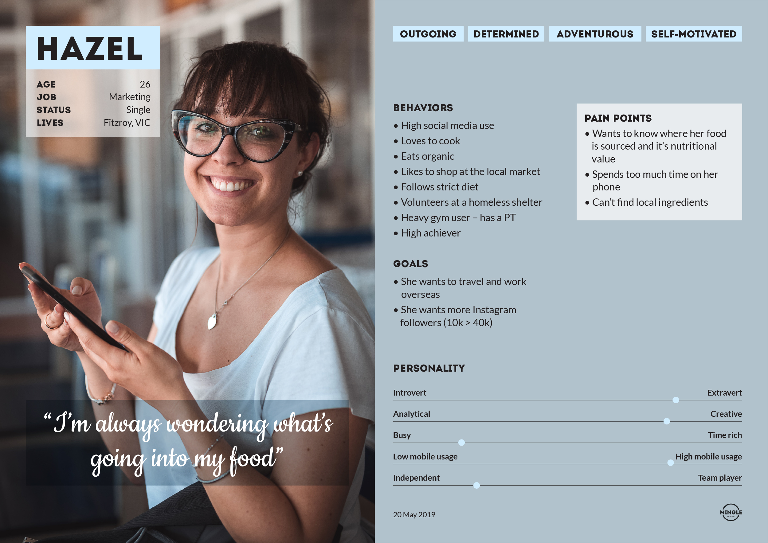
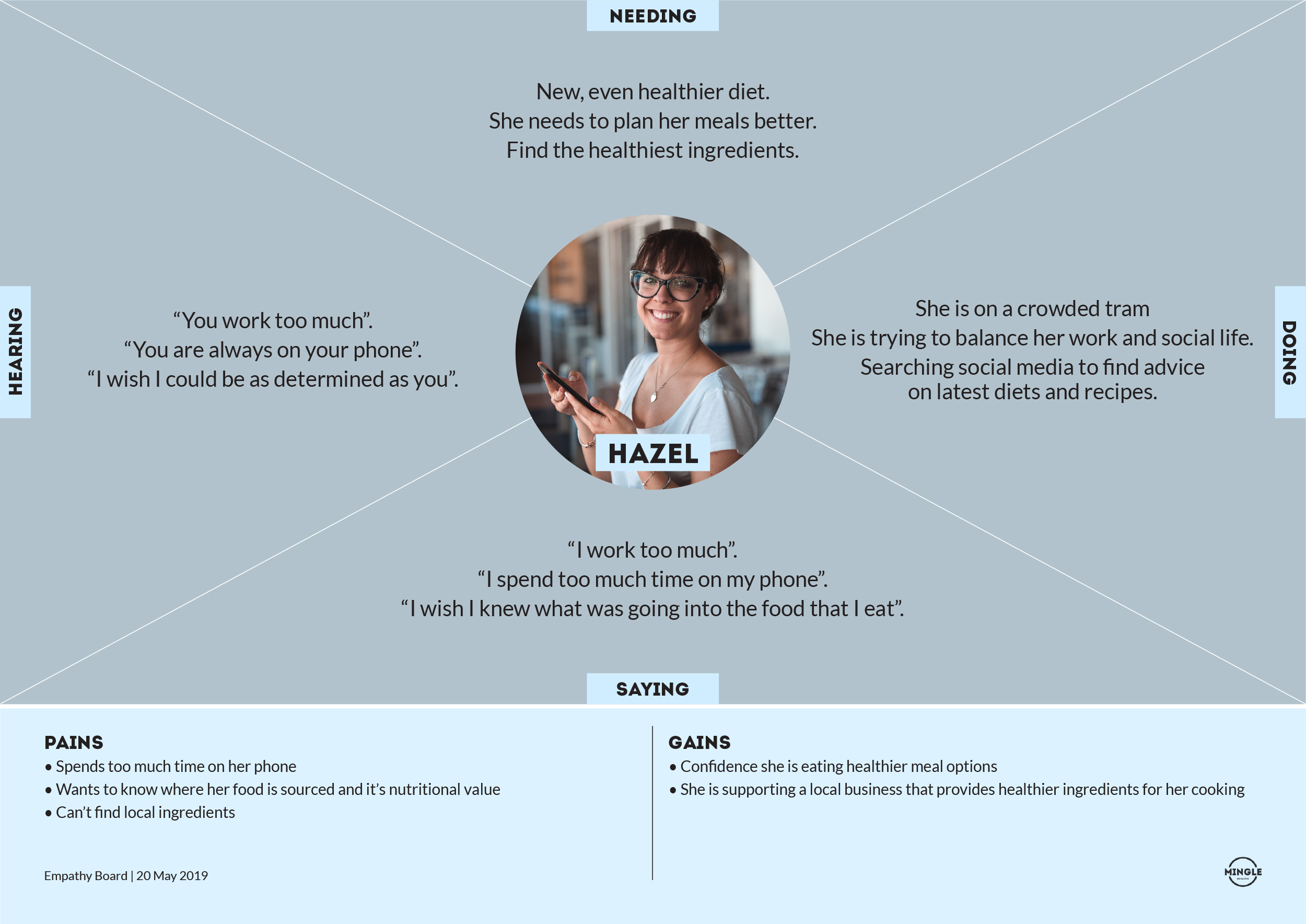
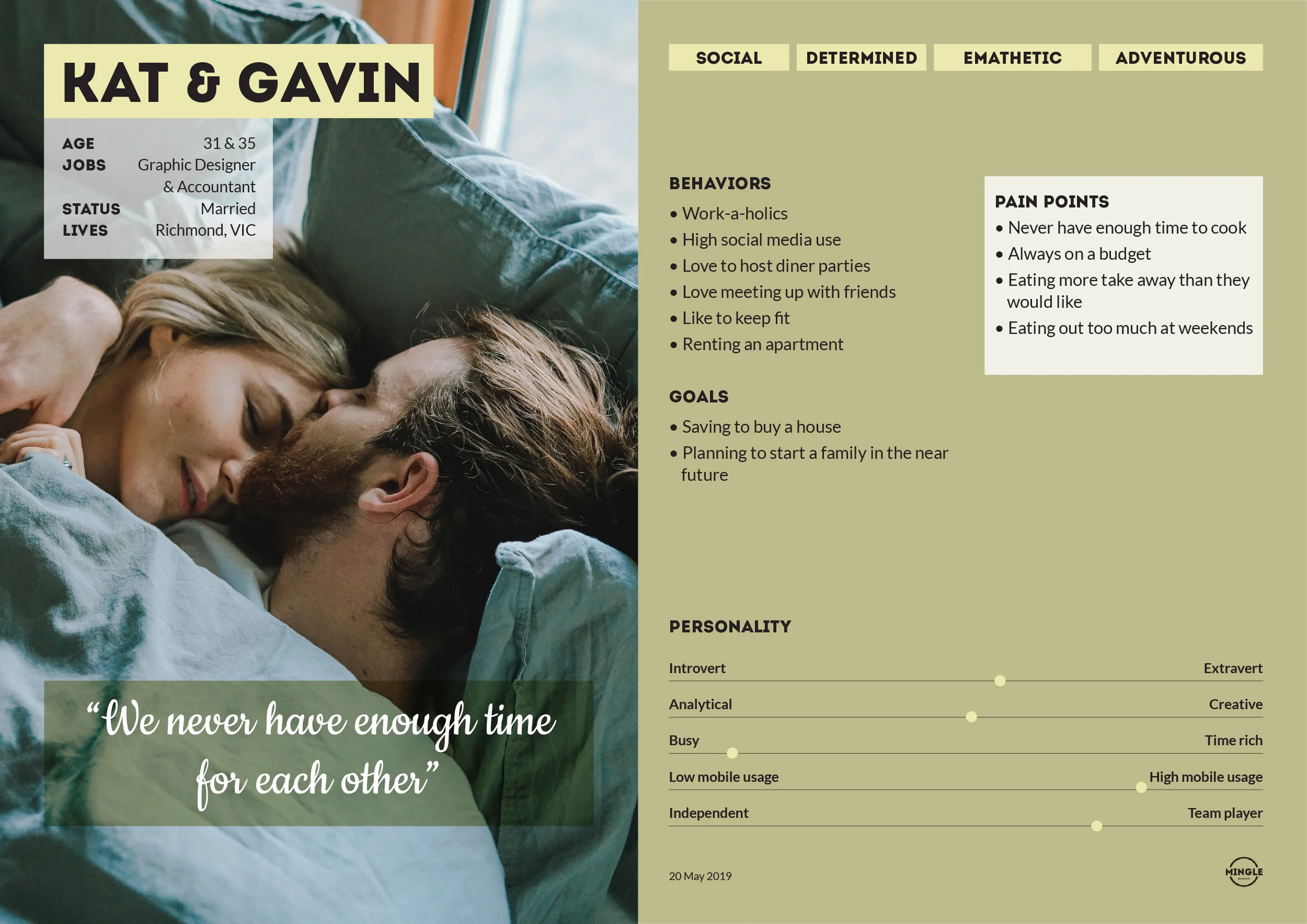
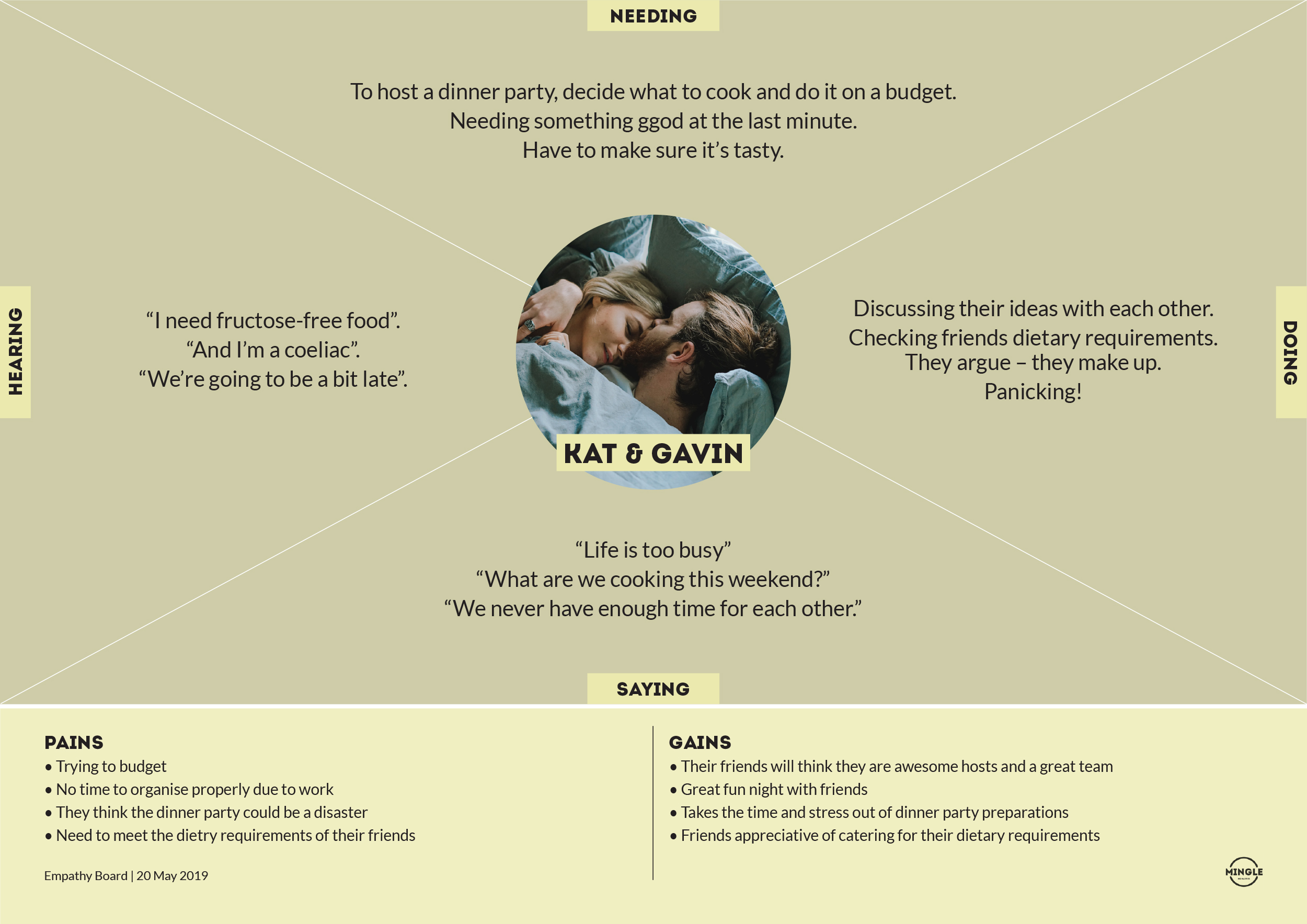
PERSONAS & EMPATHY BOARDS
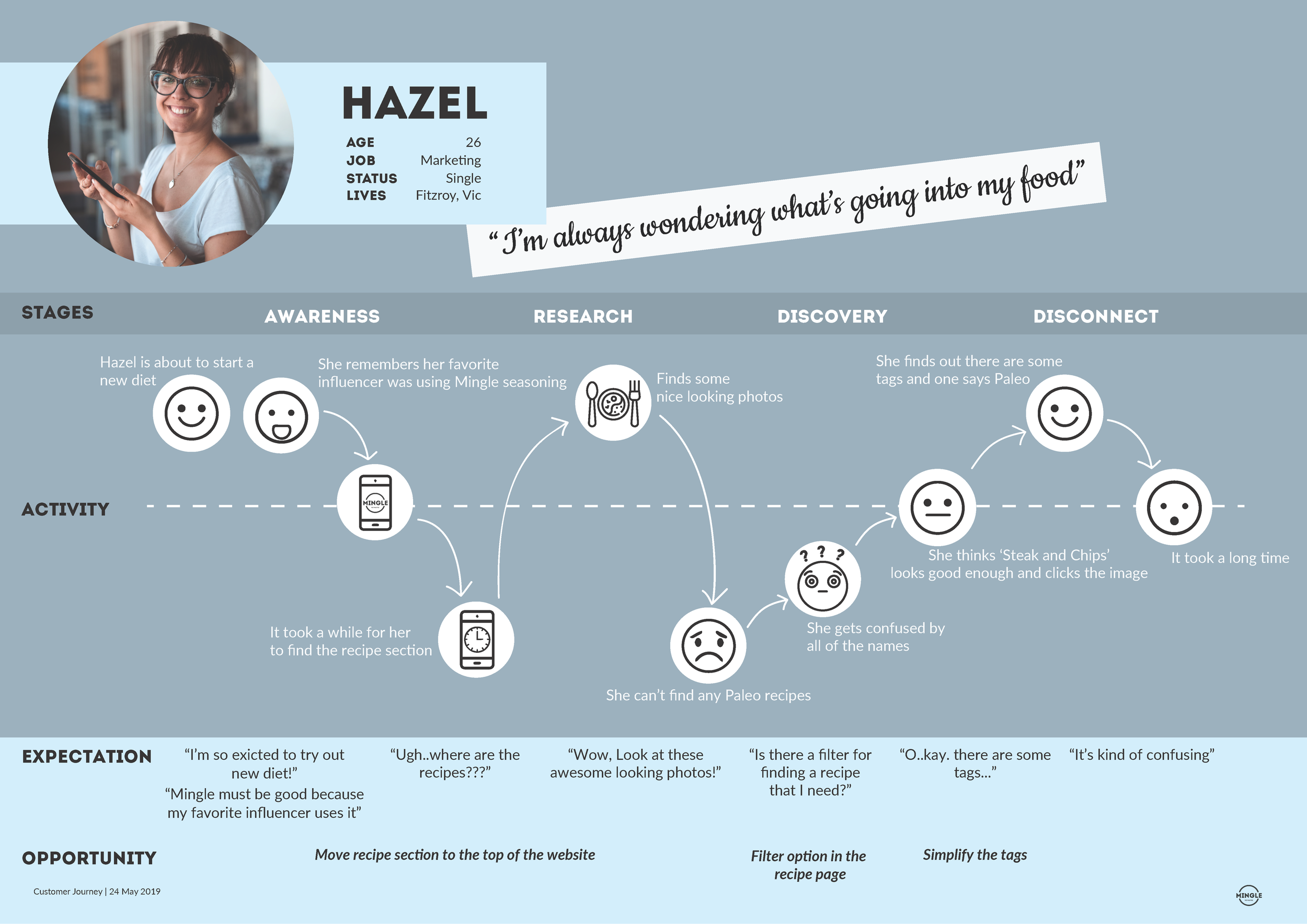
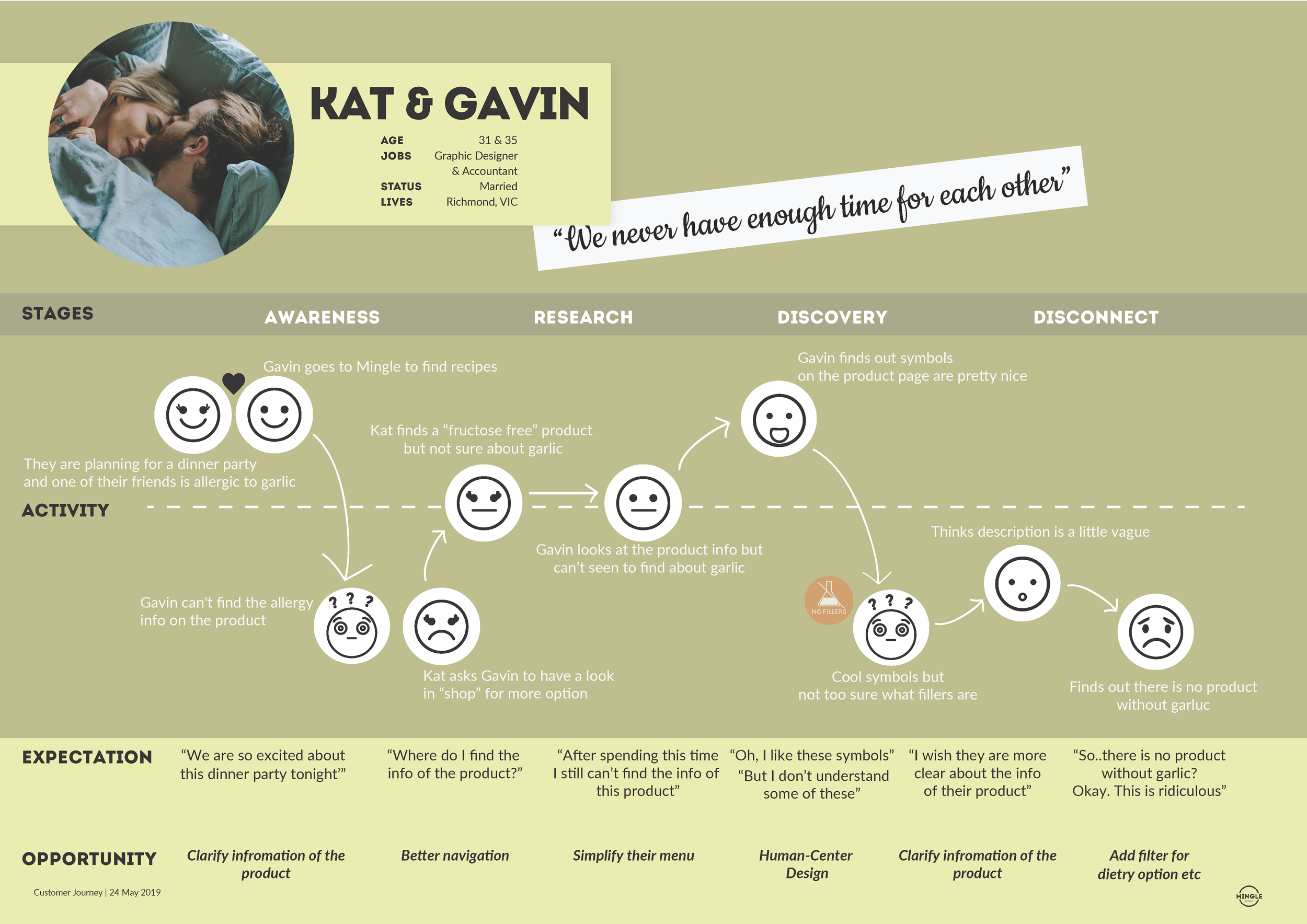
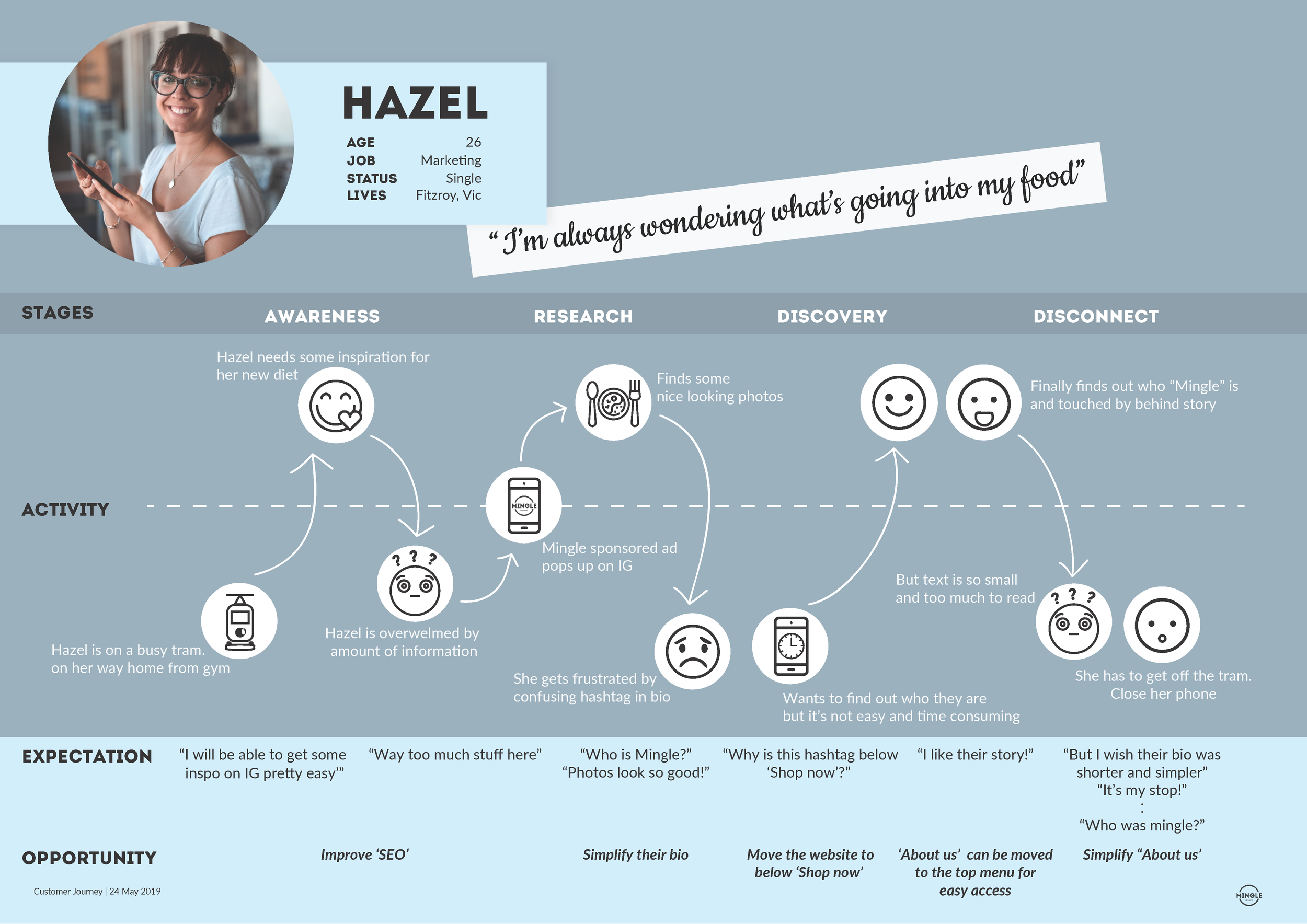
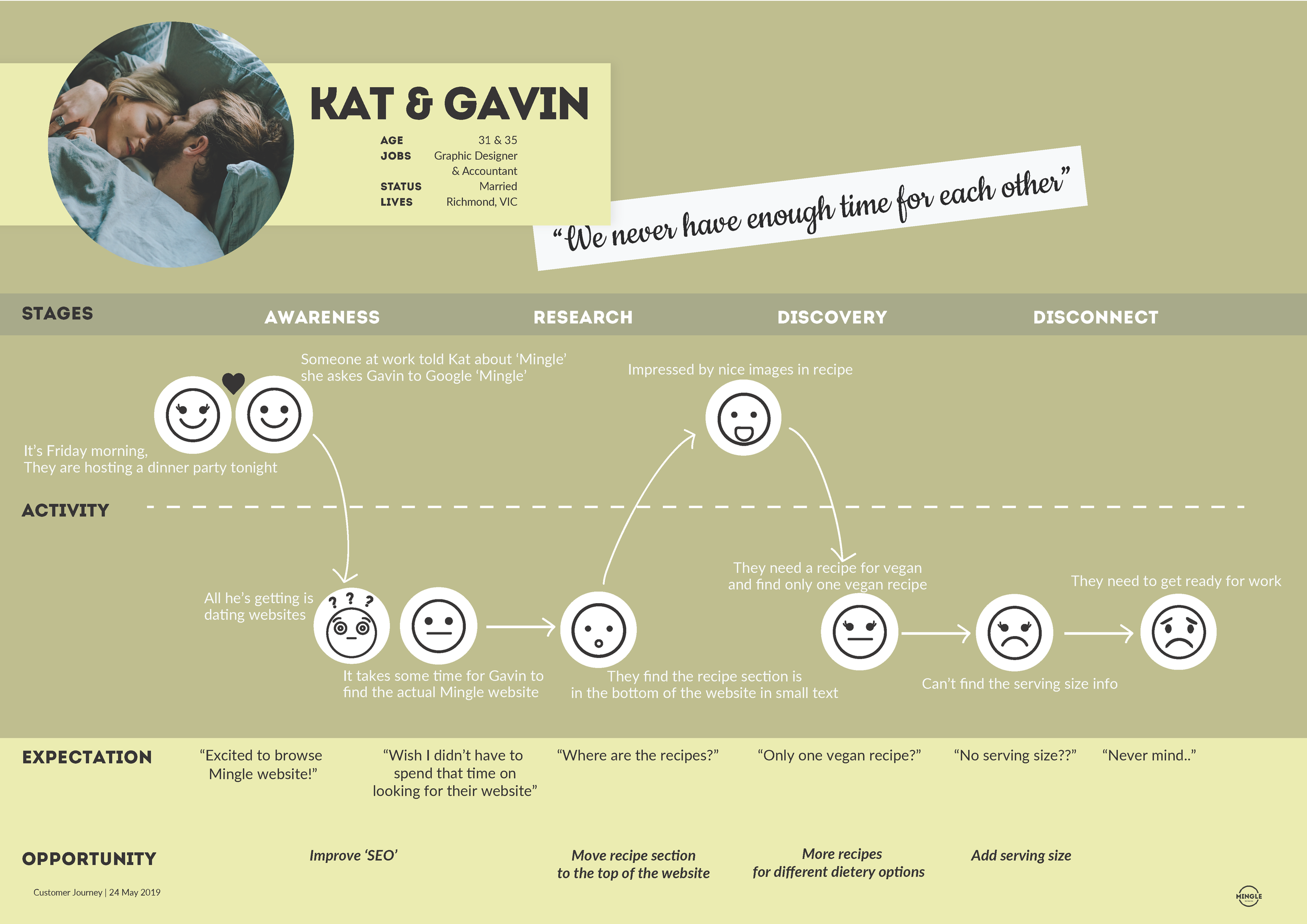
CUSTOMER JOURNEYS
REFINING THE PROBLEM STATEMENT

How might we:
Improve the Mingle experience for new and existing customers when using the mobile website.
IDEATION/CRAZY EIGHTS

MVP

IMPLEMENTATION

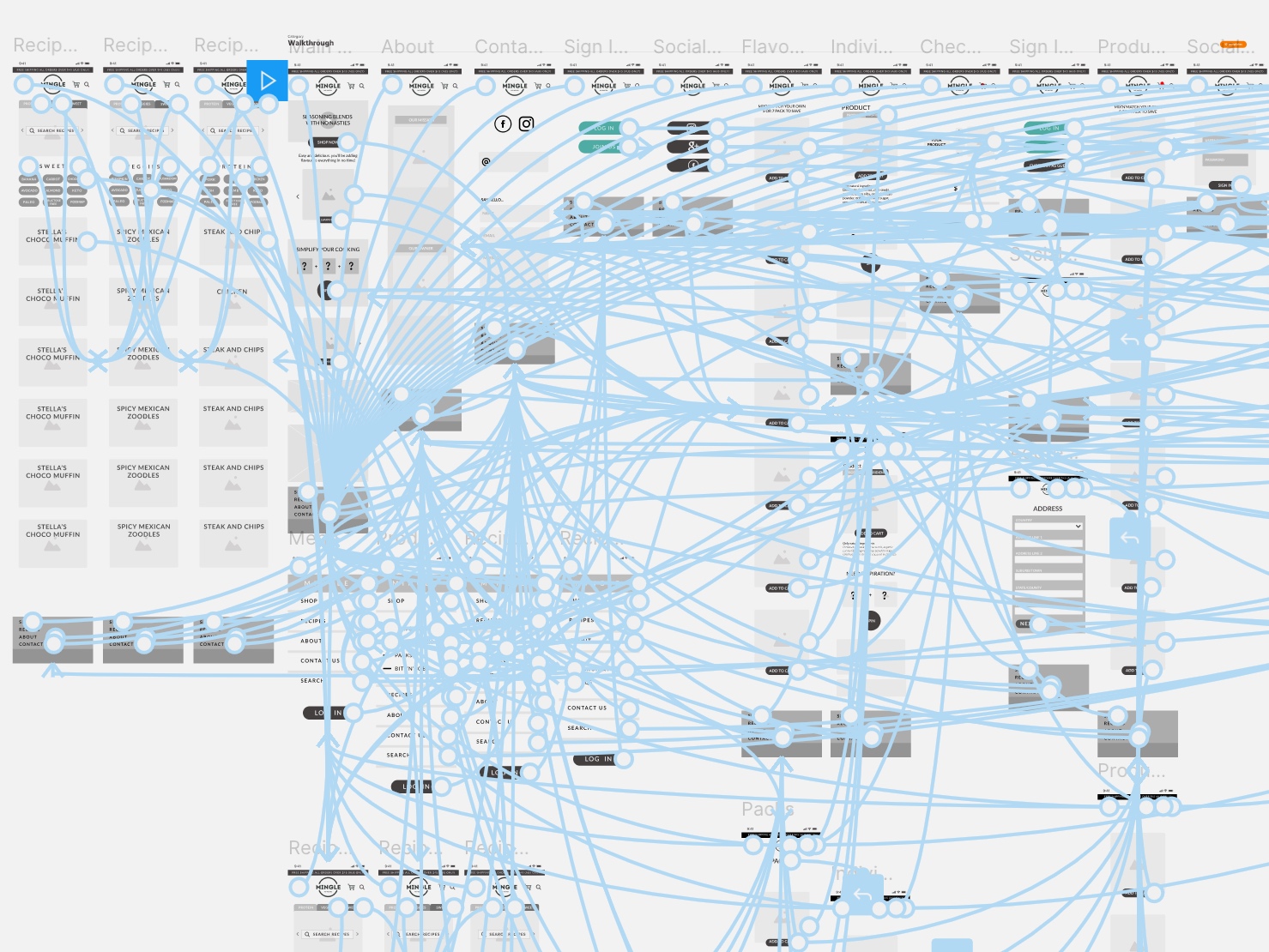
Information architecture, card sorting, user flows, wireframes and lo-fi prototypes were all part of the implementation process.


Usability testing was done continuously throughout multiple iterations of the lo-fi and hi-fi prototypes using nine different people.

HI-FI PROTOTYPE
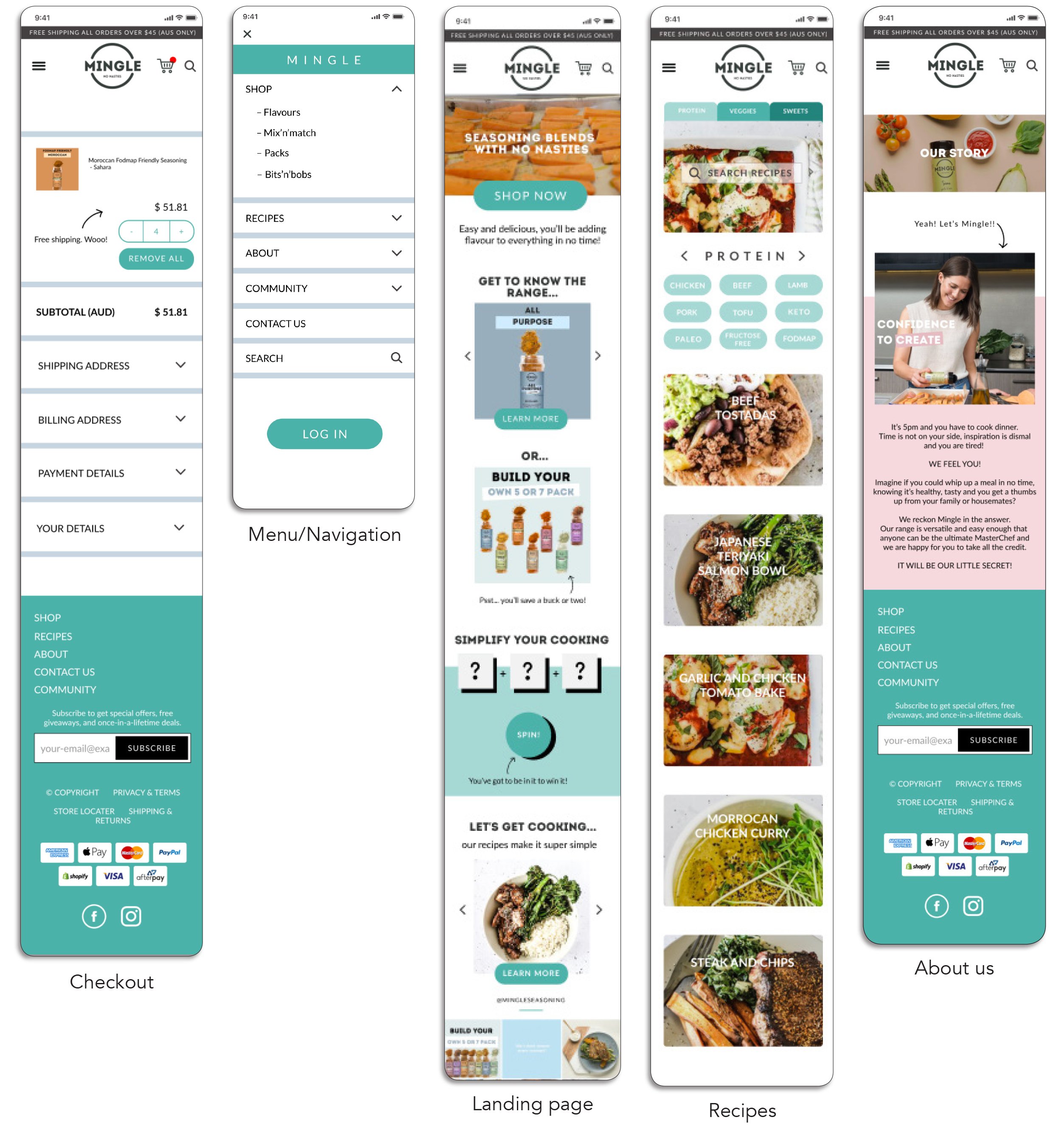
Features:
Checkout
Menu/Navigation
Landing page
Recipes
About us
NEXT STEPS
Work with a developer to implement the quick wins.