The work in this section is a mix of recent UX design work as well as other digital projects.
Fred IT Group - Australia’s largest dedicated IT solution provider to the pharmacy industry.
Fred is deeply committed to the pursuit of technological leadership and innovation that make it easier and more efficient for health professionals to run their business so they can optimise their time spent helping patients.
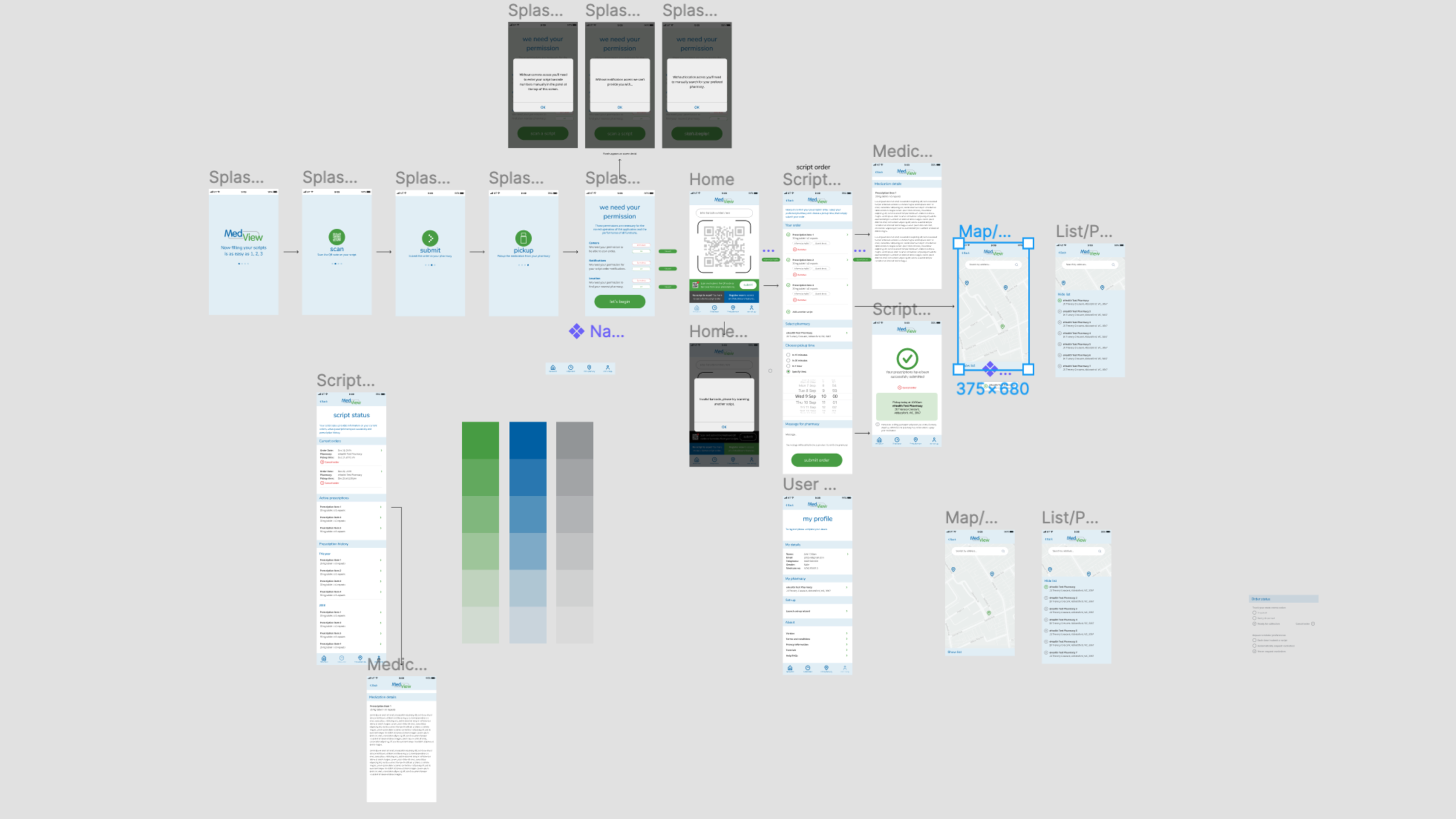
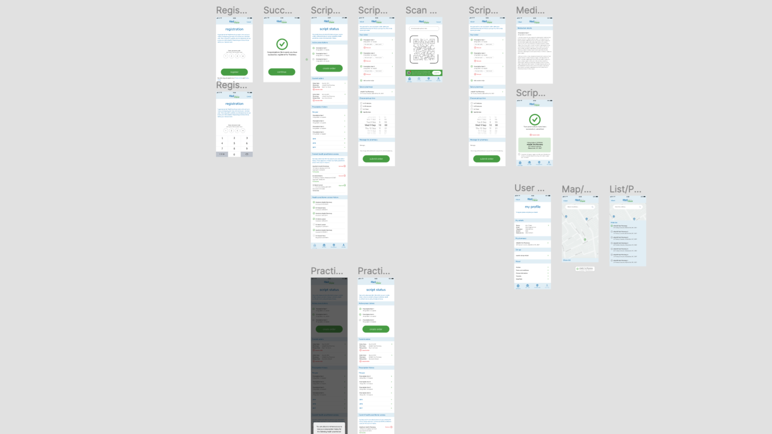
eRx Express App
The eRx Express smartphone app allows you to scan the QR or barcode code on your original or repeat script and submit it to your pharmacy, choosing a convenient day and time to collect your medication.
My brief was to improve the user flows for non-registered (trial) and registered users as well as giving the app a much need facelift.
What I did:
• Competitor analysis
• Pharmacy visit/interview
• User-flows
• Wireframes
• Lo-fi and hi-fi prototype in Figma
View prototype >
(unregistered version)
Outcome:
New version of app currently in development
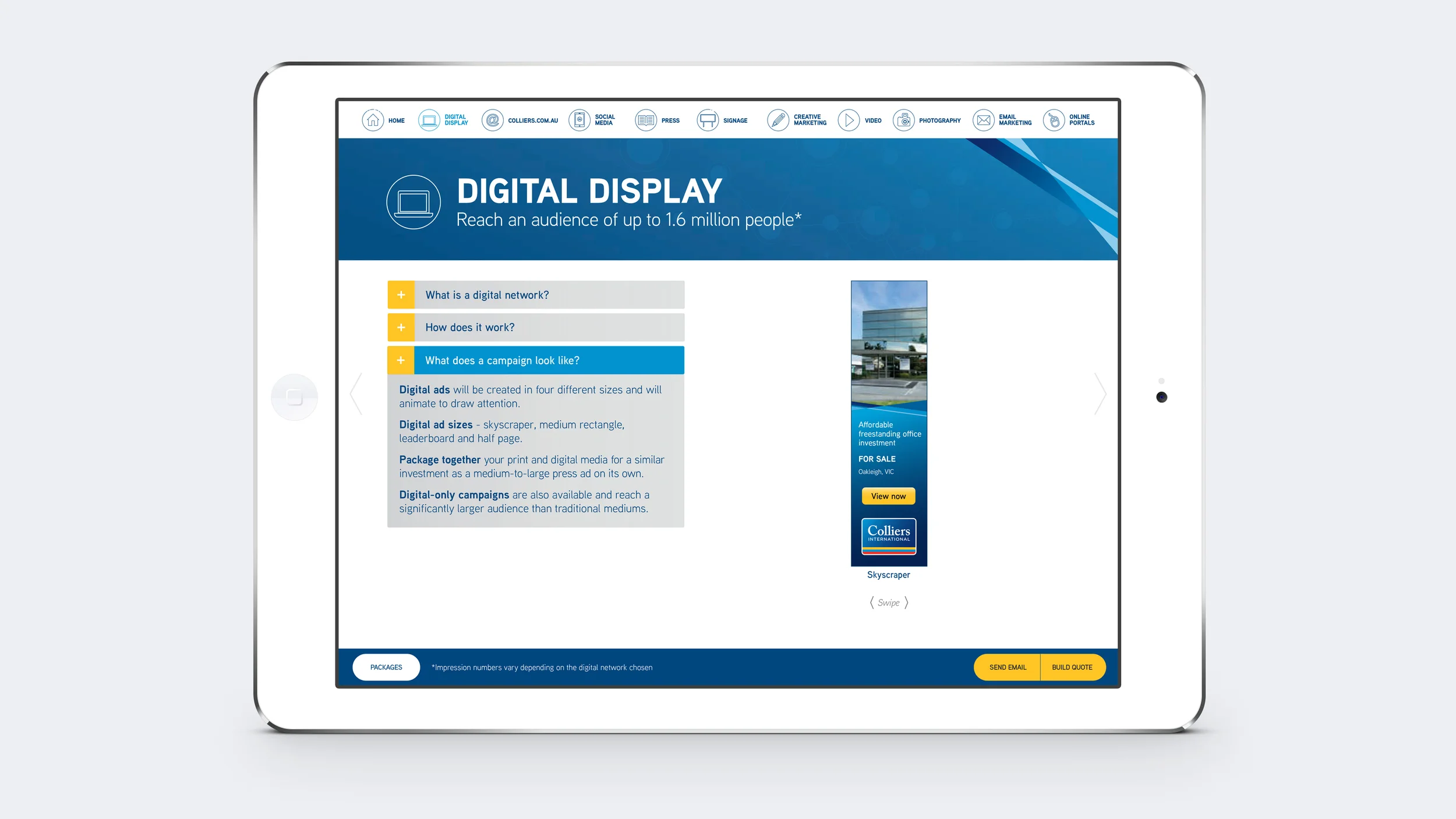
Launched in 2014 as the 'Future of Property Marketing' Colliers International changed the way commercial property was marketed in Australia.
With the positioning statement of 'Reach more people – better results faster', Colliers International offered a much greater digital focus and point-of-difference from their competitors. This included offering (as part of a sales package) property advertising on digital networks such as Fairfax, Newcorp and Exponetial, which mean't greater exposure than ever before for selling property in the Australian market.
As part of this the Colliers International brand was refreshed across all elements with press advertising modules designed with a 'Pinterest' look and feel, and the simplification of individual module layouts introducing the use of icons instead of text-heavy bullet points.
An important part of these changes to the brand was to ensure that Colliers International Sales Agents understood and were able to sell these new digital units, so a sales tool was created using Adobe Content Viewer to educate and help them sell. It included video with infographics as well as other interactive elements to highlight all the advantages of selling your property with Colliers International.
Colliers International Brand
I worked as Creative Director of Colliers International for Adcorp Australia for 5 years, overseeing teams of designers creating all aspects of the brand including: two complete Brand Refreshes, Brand Advertising in Print and Digital Media, the design of Investment Publications, Office Leasing Publications, Sales and Leasing Campaigns, Newsletters, Templated Property Advertising, Signage, etc...
Please see below for some examples.
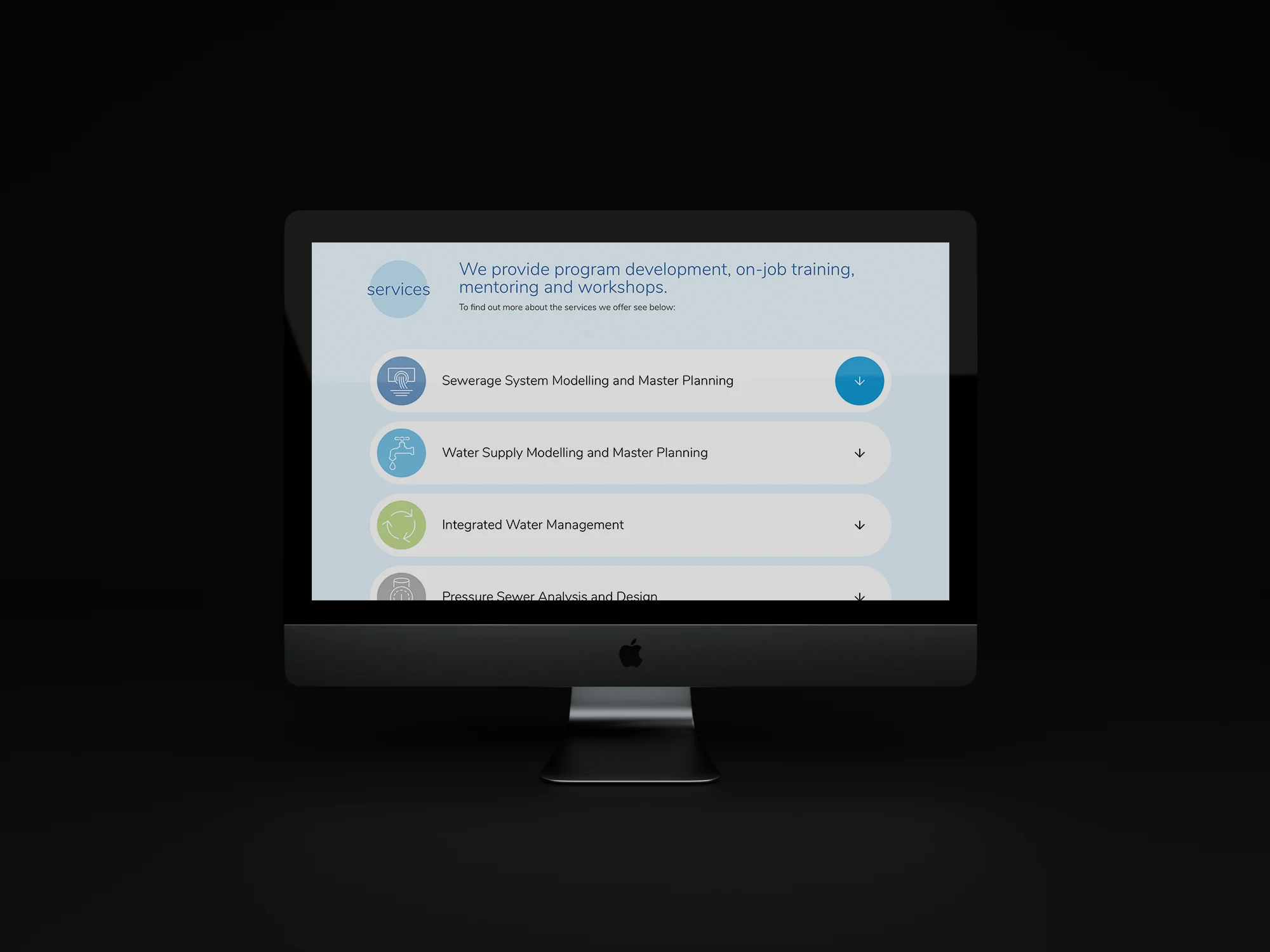
Builtwise Constructions are experts in Design & Construct, specialising in Commercial, Industrial and Retail facilities – in layman’s terms, they design, build and fit-out big sheds and they know all the angles to ensure a quality result.
Design
Taking inspiration from the angle of the ‘B’ icon of the existing logo, a new brand identity has been created for Builtwise Constructions that is bold, dynamic and contemporary. The consistent application of the angle/wedge-shape, along with strong use of the primary brand colour and the introduction of the typeface Myriad Pro, all come together to create a simple, yet powerful impression for the brand in both digital and print applications – from the new website through to promotional videos on LinkedIn, as well as business cards and a complete suite of company documents.
In early 2016, Builtwise Constructions was still using their original website from 2011 – so a new responsive website was commissioned in order to establish their industry credentials and showcase their latest projects. To view the live website visit: builtwise.com.au
The new Builtwise Constructions website was launched on LinkedIn and Instagram with posts created for both company directors to send out to their connections. These posts announced the new website as well as recently completed projects, featuring short videos that highlighted various photographic images and details of each project.
The posts have generated positive responses from industry peers and potential clients and have also increased traffic to the new responsive site.
This was Builtwise Construction’s first foray into social media and has been a positive experience for them which will see on-going promotional activity in the future.
W3 AWARDS 2015 - SILVER AWARD
INTEGRATED CAMPAIGN - FOOD & BEVERAGES
An engaging multi-channel digital campaign to promote the range of Vegeta powder stock products to the Australian market.
The approach was to use a range of digital channels, telling unique stories in each one. A landing page was developed which was the portal for a multi-channel media campaign incorporating digital network banners (include polite pre-roll videos to showcase recipe videos), video recipe production with celebrity endorsement, two competitions (one attached to the display network advertising and one social based competition) and social media strategy & execution.
LinkedIn Animated InMail Banner for ASIO Data Exploitation & Analysis Role
An imporant part of this role with ASIO (Australian Security Intelligence Organisation) was that the successful candidate needed to know the SQL programming language. This concept ensured that all applicants would have this skill as the entire animated banner was written and formatted in SQL style.
This approach was designed to resonate strongly with those that understand the SQL language and also help screen those applicants without this skill.
The copy highlighted the experience and skills required as well as job specifics and a closing date for applications. The colours used (green text on black background) were typical of these type of database management systems, adding to the credibility of the concept.
To view website go to berwickmotorbodyrepairs.com.au
Owned by ISPT Property, Bendigo Marketplace had retail space for lease and wanted to target lifestyle brands. The brief was to sell the benefits of the town of Bendigo to potential retailers including the architecture, the lifestyle, a growing population and the youth culture (Bendigo being a university town).
The graphic style needed to appeal to the 'hipsters' – and highlight the cafe/restaurant culture of the area.
The cover headline immediately established the offer as a retail leasing opportunity and asked the viewer to think about Bendigo as a good retail option.
The subhead provided three solid reasons as justification – Growing Community, Diverse Economy, Enviable Livability with the background images rotating between a classic image of an historic Bendigo hotel, a funky lane way cafe and an image from the Bendigo Cup horse races.
Headlines, images and infographics animated throughout the eBrochure,
To view website go to jpdowney.com.au
As part of the 2014 ANZAC (Australian & New Zealand Army Corps) Centenary the Australian Government set up an Arts and Culture Fund to commission artworks to commemorate this significant event.
A digital campaign was created with animated web banners announcing the beginning and closure of applications across various digital networks and Australian art websites. The animation transitioned from a photographic representation of an ANZAC soldier into the same soldier represented in the form of an oil painting.