• BRAND
  • PROPERTY & CONSTRUCTION
  • HEALTHCARE & PHARMACEUTICAL
  • DIGITAL & UX DESIGN
  • PHOTOGRAPHY & DRONE
  • ABOUT
  • CONTACT
Menu

MARK WEBSTER

  • BRAND
  • PROPERTY & CONSTRUCTION
  • HEALTHCARE & PHARMACEUTICAL
  • DIGITAL & UX DESIGN
  • PHOTOGRAPHY & DRONE
  • ABOUT
  • CONTACT

COLLIERS INTERNATIONAL

Launched as the 'Future of Property Marketing' Colliers International changed the way commercial property was marketed in Australia.

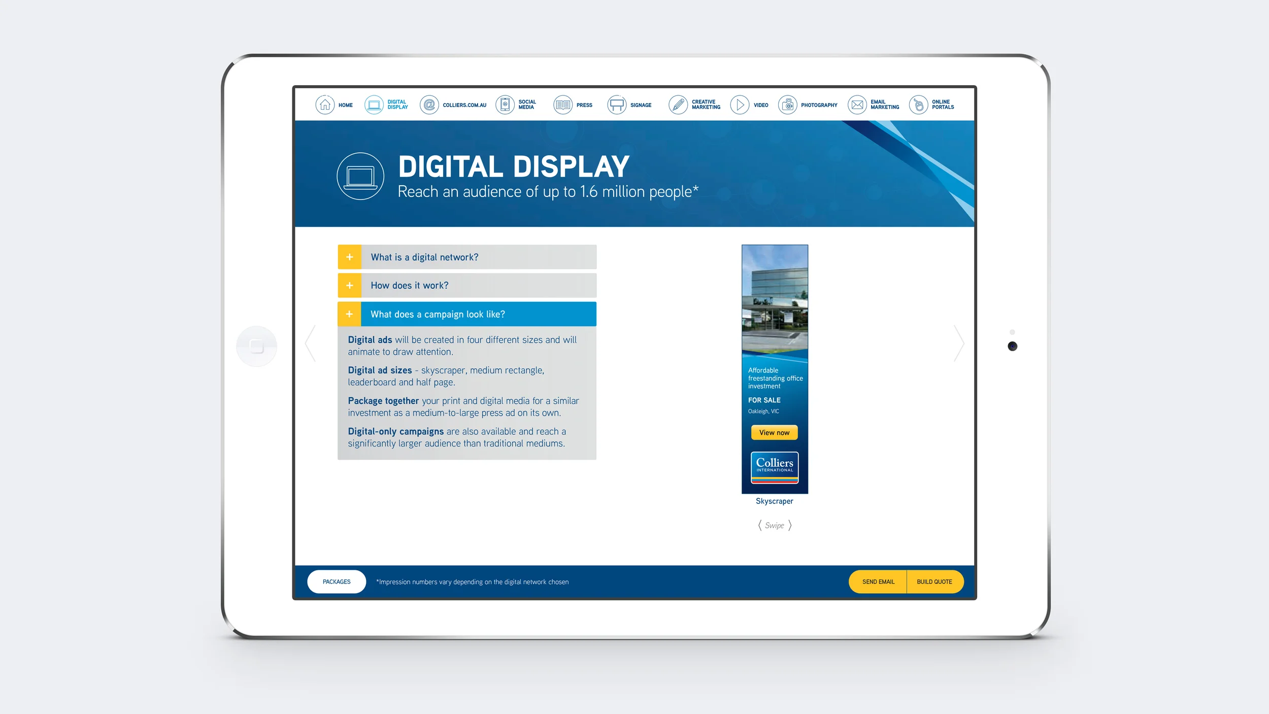
With the positioning statement of 'Reach more people – better results faster', Colliers International offered a much greater digital focus and point-of-difference from their competitors. This included offering (as part of a sales package) property advertising on digital networks such as Fairfax, Newcorp and Exponetial, which mean't greater exposure than ever before for selling property in the Australian market.

As part of this the Colliers International brand was refreshed across all elements with press advertising modules designed with a 'Pinterest' look and feel, and the simplification of individual module layouts introducing the use of icons instead of text-heavy bullet points.

An important part of these changes to the brand was to ensure that Colliers International Sales Agents understood and were able to sell these new digital units, so a sales tool was created using Adobe Content Viewer to educate and help them sell. It included video with infographics as well as other interactive elements to highlight all the advantages of selling your property with Colliers International.

Colliers International Brand
I worked as Creative Director of Colliers International for Adcorp Australia for 5 years, overseeing teams of designers creating all aspects of the brand including: two complete Brand Refreshes, Brand Advertising in Print and Digital Media, the design of Investment Publications, Office Leasing Publications, Sales and Leasing Campaigns, Newsletters, Templated Property Advertising, Signage, etc...

Please see below for some examples.

Project Blue sales tool.jpg
Project Blue sales tool 2.jpg
Project Blue sales tool menu.jpg
Project Blue sales tool 5.jpg
Project Blue sales tool 3.jpg
Project Blue sales tool 6.jpg
Project Blue sales tool 4.jpg
Project Blue sales tool 8.jpg
Project Blue sales tool 7.jpg
Project Blue sales tool 9.jpg
Project Blue sales tool 10.jpg
Project Blue sales tool 12.jpg
IMG_1563_iphone5s_spacegrey_portrait.png
CEO_ad_1.jpg
CapMarkets_detail.jpg
MovingTimes Cover_v1Cropped.jpg
MovingTimes Spread 2.jpg

Colliers International – Moving Times

Angle 90 - Cover Closed_MovingTimes.jpg
MovingTimes Cover_v1Cropped.jpg
MovingTimes Spread 2.jpg
MovingTimes Spread 1.jpg
MovingTimes Spread 3.jpg
Angle 45 - Cover Closed_MovingTimes2.jpg
Moving Times spread1.jpg
Moving Times spread2.jpg

VILLAWOOD PROPERTIES

Villawood Properties required an update to their brand style guide. The new document needed to reflect the way the brand style had evolved over several years and provide direction for Villawood staff and their suppliers. The task involved an assessment of the current brand direction and a complete re-design and re-writing of the content.

Villawood_SG_1_tile.jpg
Villawood_SG_2.jpg
Villawood_SG_4.jpg
Villawood_SG_3.jpg

Colliers International - Capital Markets Report

Colliers International's annual report on the state of the Australian commercial property market – the 'Australian Capital Markets Report' highlighted the effects and influence that foreign markets played in the local setting providing insights and advice, whilst also highlighting Colliers International's services and expertise.

'A shift in buyer profile'

In 2013 there were more buyers from Asia, (especially China) who were competing for core assets within Australia than ever before – printed with a metallic silver finish, the cover imagery brought this idea to life with a graphic mix of international currencies forming the key visual and setting the graphic style for the publication.

Angle 90 - Cover Closed_CapMarkets_detail.jpg
Angle 45 - Cover Closed_CapMarkets2.jpg

385 Bourke Street – Leasing Campaign


The big idea was to ‘own the corner.’ 

The name b|e came from the street names of the proposed tower’s location; Bourke and Elizabeth Streets in Melbourne. This abbreviation not only helped define the iconic location, but also created a verb that introduced all headlines and marketing statements for the campaign… b|e inspired, b|e impressive, b|e green… 

A simple yet powerful idea with a clean, elegant design, metallic silver was used in various print and digital media to highlight the sophisticated leasing opportunity.

b|e cover.jpg
b|e_spread1.jpg
b|e_spread3.jpg
b|e_spread2.jpg
b|e mag ad.jpg
Mac Screen b|e1.jpg
Mac Screen b|e2.jpg
Mac Screen b|e3.jpg
Mac Screen b|e4.jpg
Mac Screen b|e5.jpg
Mac Screen b|e6.jpg

50 Marcus Clarke Street – Information Memorandum

50 Markus Clarke cover.jpg
50 Markus Clarke spread1.jpg
50 Markus Clarke spread2.jpg

Octavia Apartments – Integrated Campaign

The Octavia Apartments were a landmark St Kilda development with true architectural presence and a luxurious interior style. This boutique offering was limited to 33 apartments – all with a dramatic style that appealed to a select market.

The design approach embraced this style and achieved cut-through, reinforcing the strong interior colour schemes of the luxurious apartments with the use of an upholstered red leather background as the signature look for the campaign.

Collateral for the campaign included: a 12 page brochure, press advertising, building site signage, eDM and printed launch party invitations, as well as a landing page and mobile landing page.

Octavia_A4_Booklet_WithInsidePages-01.jpg
A4_Brochure_Cover_Spread_OCTAVIA.jpg
Website_Display_OCTAVIA.jpg
MOBILE_WEBSITE_OCTAVIA.jpg
EDM_OCTAVIA_IPAD.jpg
OCTAVIA_DL_INVITE.jpg
OCTAVIA PRESS AD.jpg

818 Bourke Street – Information Memorandum

818 Bourke cover.jpg
818 Bourke spread1.jpg
818 Bourke spread2.jpg

BENDIGO MARKETPLACE FOR ISPT

Owned by ISPT Property, Bendigo Marketplace had retail space for lease and wanted to target lifestyle brands. The brief was to sell the benefits of the town of Bendigo to potential retailers including the architecture, the lifestyle, a growing population and the youth culture (Bendigo being a university town).

The graphic style needed to appeal to the 'hipsters' – and highlight the cafe/restaurant culture of the area.

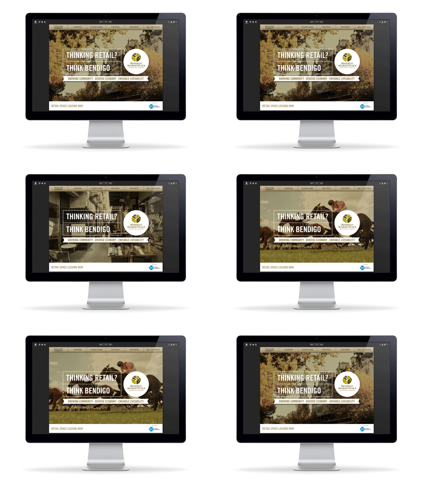
The cover headline immediately established the offer as a retail leasing opportunity and asked the viewer to think about Bendigo as a good retail option.

The subhead provided three solid reasons as justification – Growing Community, Diverse Economy, Enviable Livability with the background images rotating between a classic image of an historic Bendigo hotel, a funky lane way cafe and an image from the Bendigo Cup horse races.

Headlines, images and infographics animated throughout the eBrochure,

Bendigo_animated.gif
Bendigo_p2.jpg
Bendigo_p3.jpg
Bendigo_p4.jpg
Bendigo_p5.jpg
Bendigo_p6.jpg

BUILTWISE CONSTRUCTIONS

Builtwise Constructions are experts in Design & Construct, specialising in Commercial, Industrial and Retail facilities – in layman’s terms, they design, build and fit-out big sheds and they know all the angles to ensure a quality result.


Design
Taking inspiration from the angle of the ‘B’ icon of the existing logo, a new brand identity has been created for Builtwise Constructions that is bold, dynamic and contemporary. The consistent application of the angle/wedge-shape, along with strong use of the primary brand colour and the introduction of the typeface Myriad Pro, all come together to create a simple, yet powerful impression for the brand in both digital and print applications – from the new website through to promotional videos on LinkedIn, as well as business cards and a complete suite of company documents.

In early 2016, Builtwise Constructions was still using their original website from 2011 – so a new responsive website was commissioned in order to establish their industry credentials and showcase their latest projects. To view the live website visit: builtwise.com.au

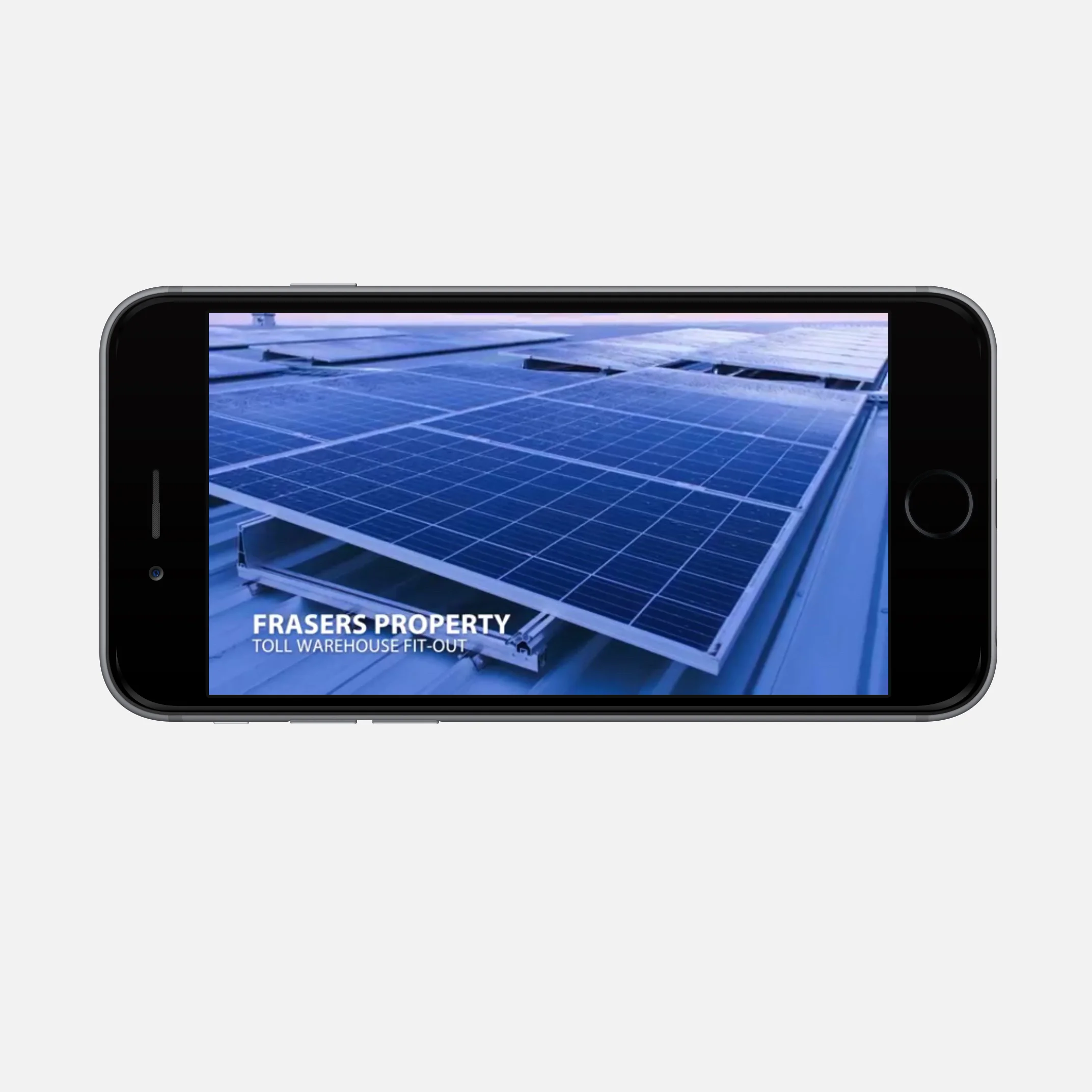
The new Builtwise Constructions website was launched on LinkedIn and Instagram with posts created for both company directors to send out to their connections. These posts announced the new website as well as recently completed projects, featuring short videos that highlighted various photographic images and details of each project.

The posts have generated positive responses from industry peers and potential clients and have also increased traffic to the new responsive site.

This was Builtwise Construction’s first foray into social media and has been a positive experience for them which will see on-going promotional activity in the future.

Realistic 5k iMac Mockup - Homepage.jpg
Realistic 5k iMac Mockup - Projects 1.jpg
Realistic 5k iMac Mockup - Projects 2.jpg
Smartphone Mockup_About_Us.jpg
Women Holding iPhone 6 Mockup.jpg
Smartphone Mockup_Trent.jpg
LinkedIn-Mockup-2.jpg
LinkedIn-Mockup-1.jpg
LinkedIn-Mockup-3.jpg
Screen_mockup_v1.jpg
Builtwise Business Cards MockUp.jpg
A4-letterhead.jpg
A4-Mock Ups_v2.jpg

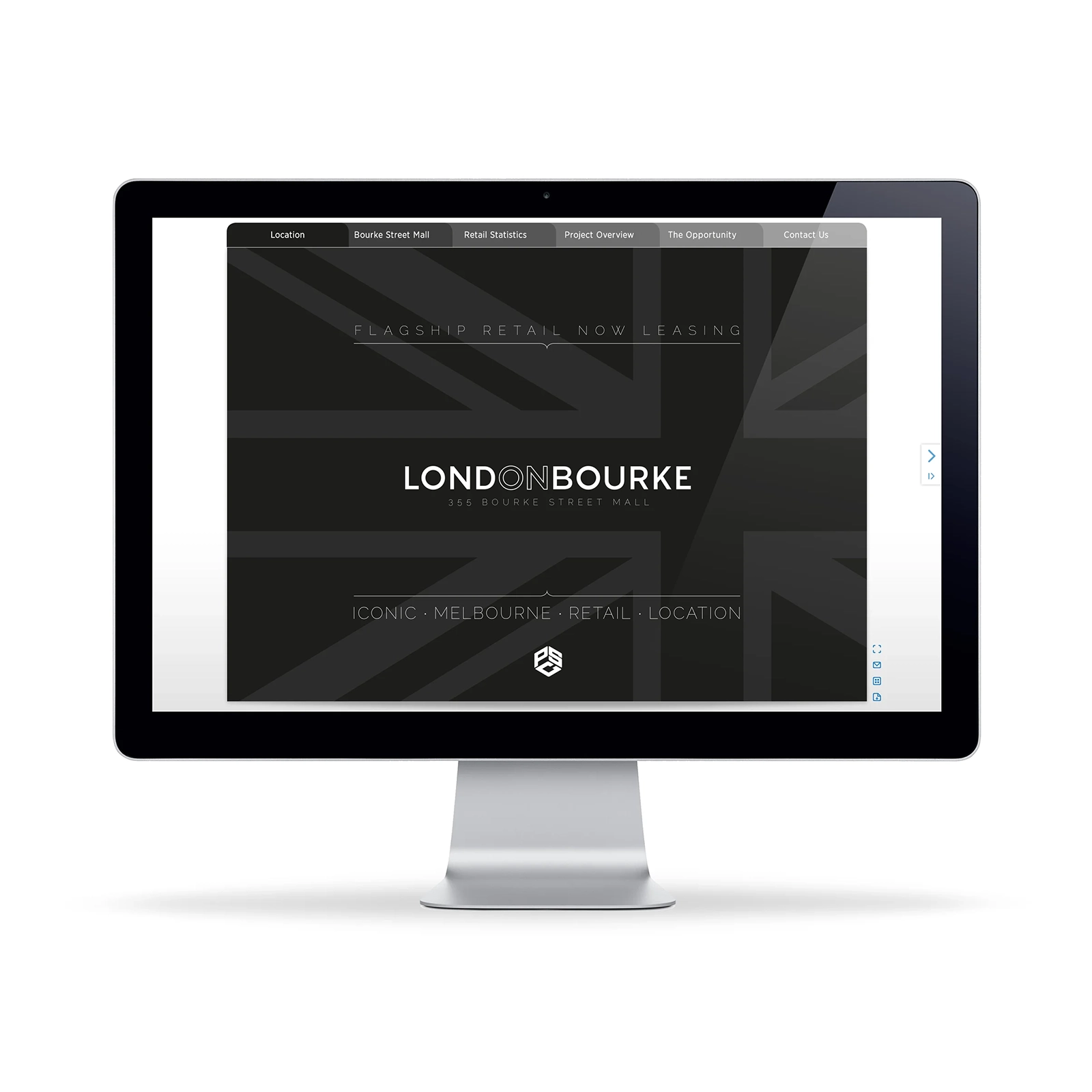
London on Bourke – Animated eBrochure

eBrochure for the leasing of flagship retail space

To appeal to international retailers and highlight the opportunity as the last flagship retail space available on Bourke Street in Melbourne's CBD, the name change to 'London on Bourke' was proposed for the landmark London Stores Building located on the high profile corner of Bourke and Elizabeth Streets.

Creative included the new name, logo design, positioning statement and six pages of layout with animated headlines, renders and photography, map and floorpans which brought the opportunity to life.


LOB_FC.jpg
LOB_p2.jpg
LOB_p3.jpg
LOB_p4.jpg
LOB_p5.jpg

Urban Water Solutions Website

www.urbanwatersolutions.com

iphone8_UWS_1.jpg
iphone8_UWS_2.jpg
iphone8_UWS_3.jpg
iphone8_UWS_4.jpg
iphone8_UWS_5.jpg
iphone8_UWS_6.jpg
iMac_UWS_1.jpg
iMac_UWS_2.jpg
iMac_UWS_3.jpg
iMac_UWS_4.jpg
iMac_UWS_5.jpg
prev / next
Back to PROPERTY & CONSTRUCTION
Colliers Sales Tool.jpg
17
COLLIERS INTERNATIONAL
Angle 90 - Cover Closed_MovingTimes.jpg
8
Colliers International – Moving Times
4
VILLAWOOD PROPERTIES
Angle 90 - Cover Closed_CapMarkets_detail.jpg
2
Colliers International - Capital Markets Report
b|e cover.jpg
11
385 Bourke Street
50 Markus Clarke cover.jpg
3
50 Marcus Clarke Street – Information Memorandum
Octavia_A4_Booklet_WithInsidePages-01.jpg
7
Octavia Apartments – Integrated Campaign
818 Bourke cover.jpg
3
818 Bourke Street – Information Memorandum
Bendigo_animated.gif
7
BENDIGO MARKETPLACE FOR ISPT
Builtwise_website.jpg
13
BUILTWISE CONSTRUCTIONS
LOB_FC.png
5
London on Bourke – Animated eBrochure
UWS_tile.jpg
11
URBAN WATER SOLUTIONS