I have a vast experience working on healthcare and pharmaceutical brands where research and insights are brought to life.
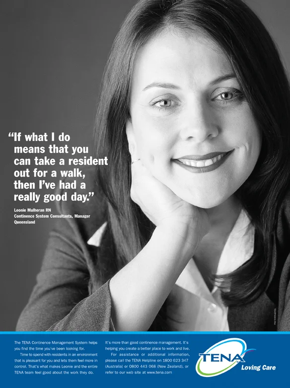
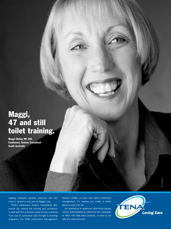
A pitch winning idea to make the TENA consultants the heroes brought life and understanding to a difficult area — continence management for residents of aged care facilities. The campaign was rolled out across Australia and New Zealand in print advertising, sales brochures through to business cards
Winner: Silver Rx Award
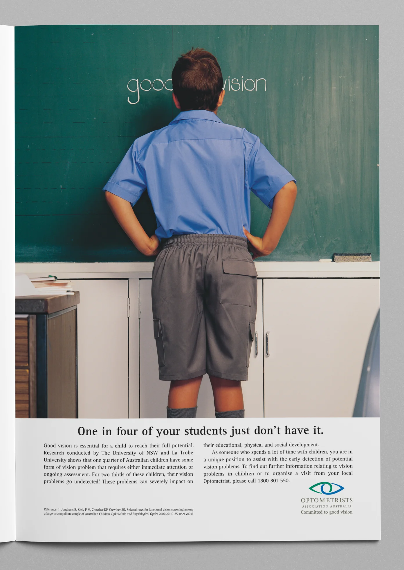
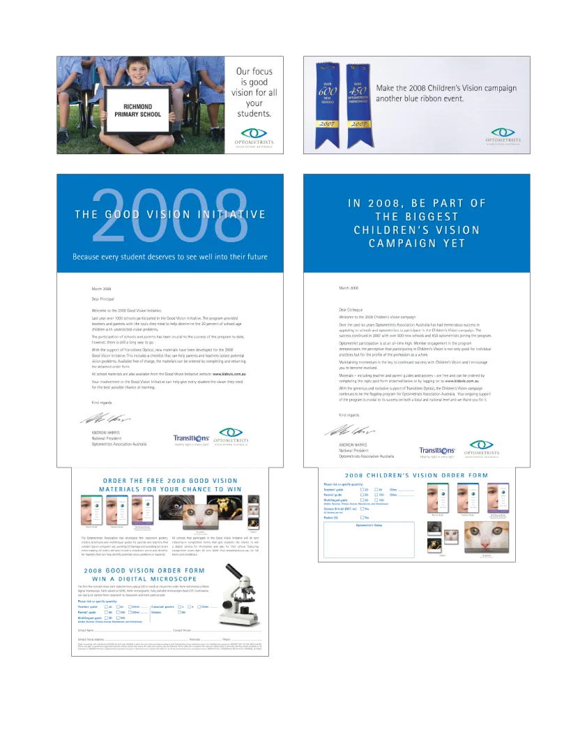
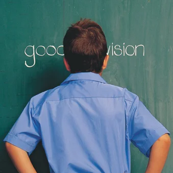
This campaign targeted schools and school teachers and was launched by OAA to help promote the early detection of vision problems in children, so that they could go on to reach their full potential. In this concept the headline and visual work strongly together to get this important message across.
There is an element of humour/irony with regards to how close to the chalkboard this student needs to be to read the key message of 'good vision'. The headline then expands on the problem with a double entendre — one in four students just don't have good vision (as stated in the supporting study), but the term 'doesn't have it' is also a statement that may be made about a student with limited learning capacity — which in turn, prompts the viewer to think that maybe it is the student's vision that is affecting the students capacity to learn!
The campaign ran for a number of years in school magazines, posters and other press advertising and was also supported by a direct mail campaign with competitions and incentives for schools and students who ordered materials and participated in the program.
Winner: Gold & Silver Rx Awards
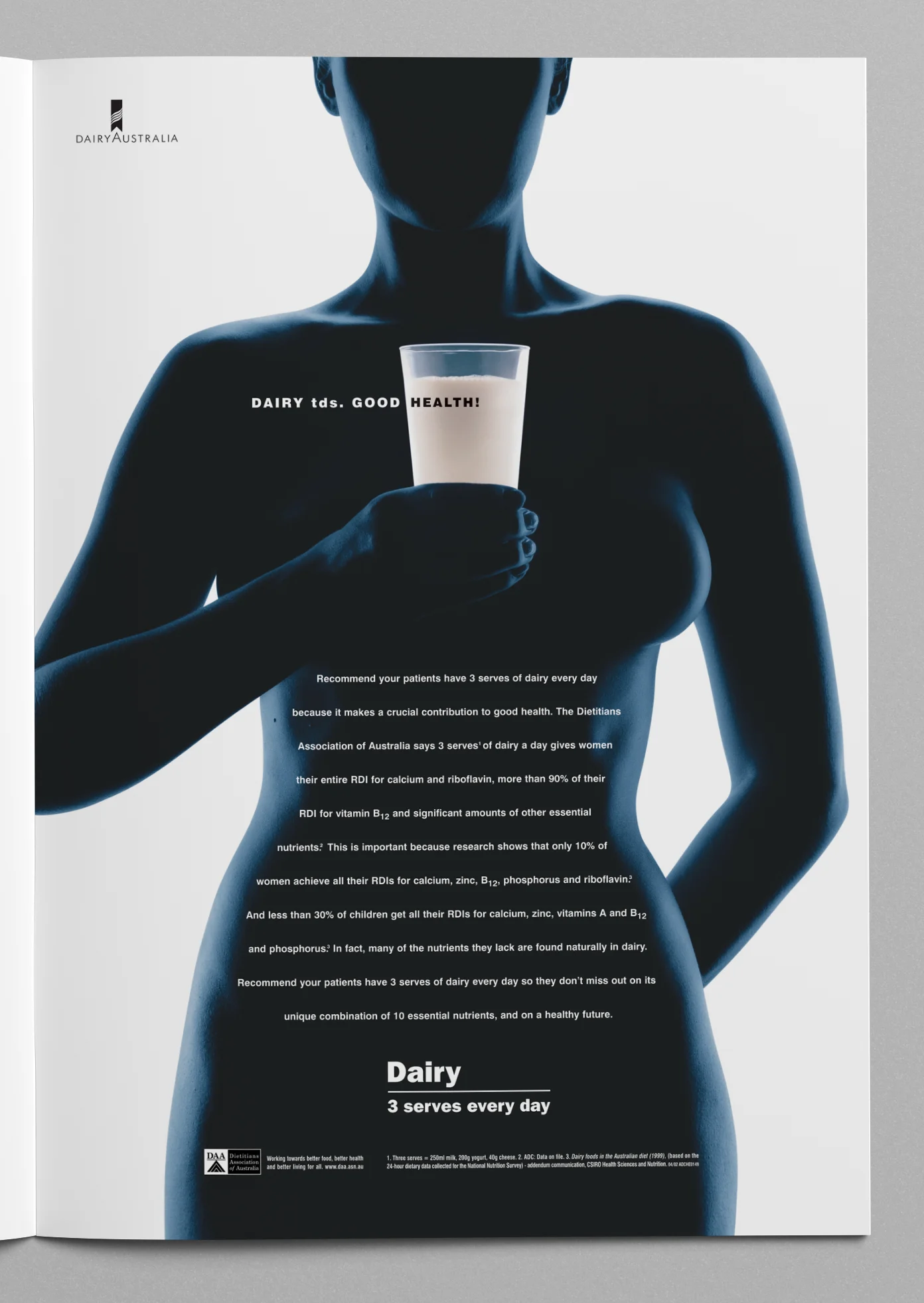
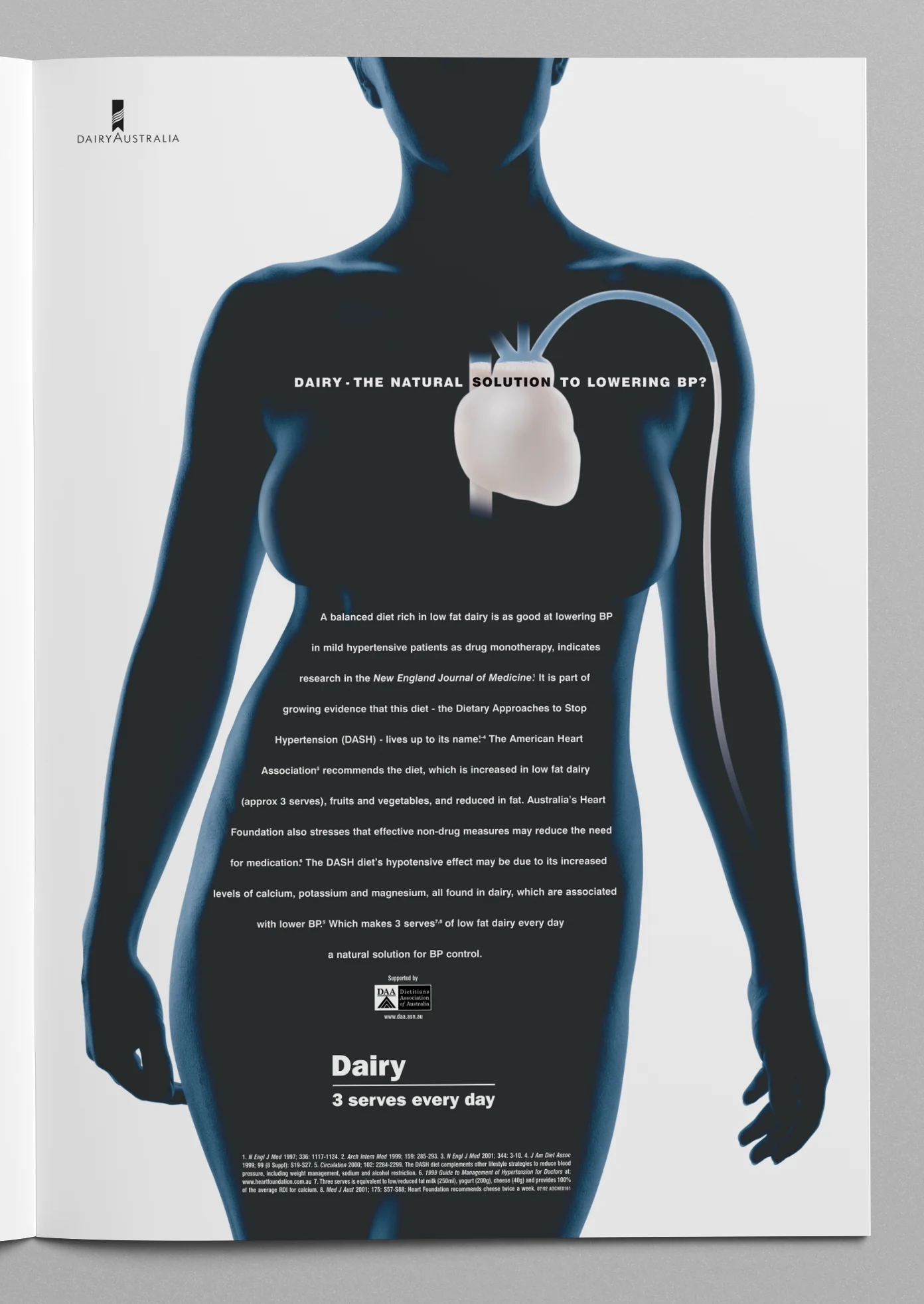
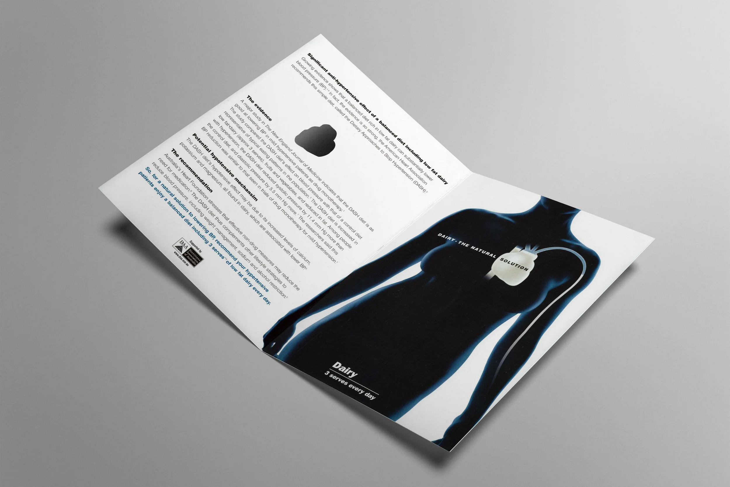
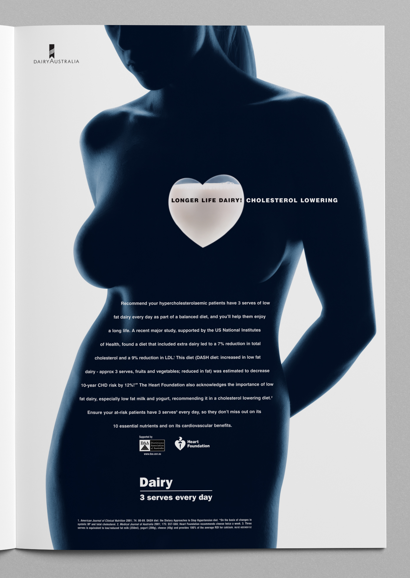
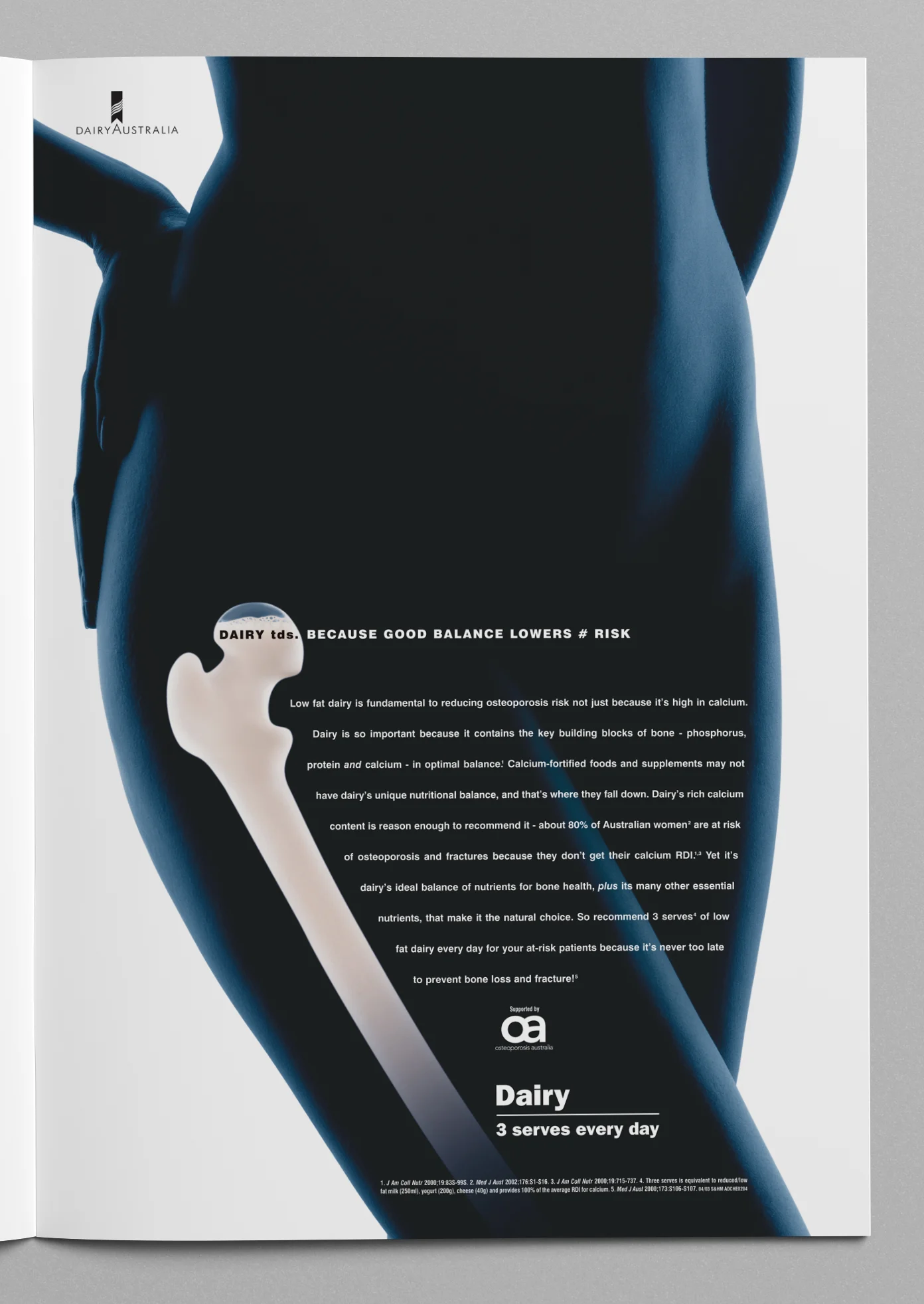
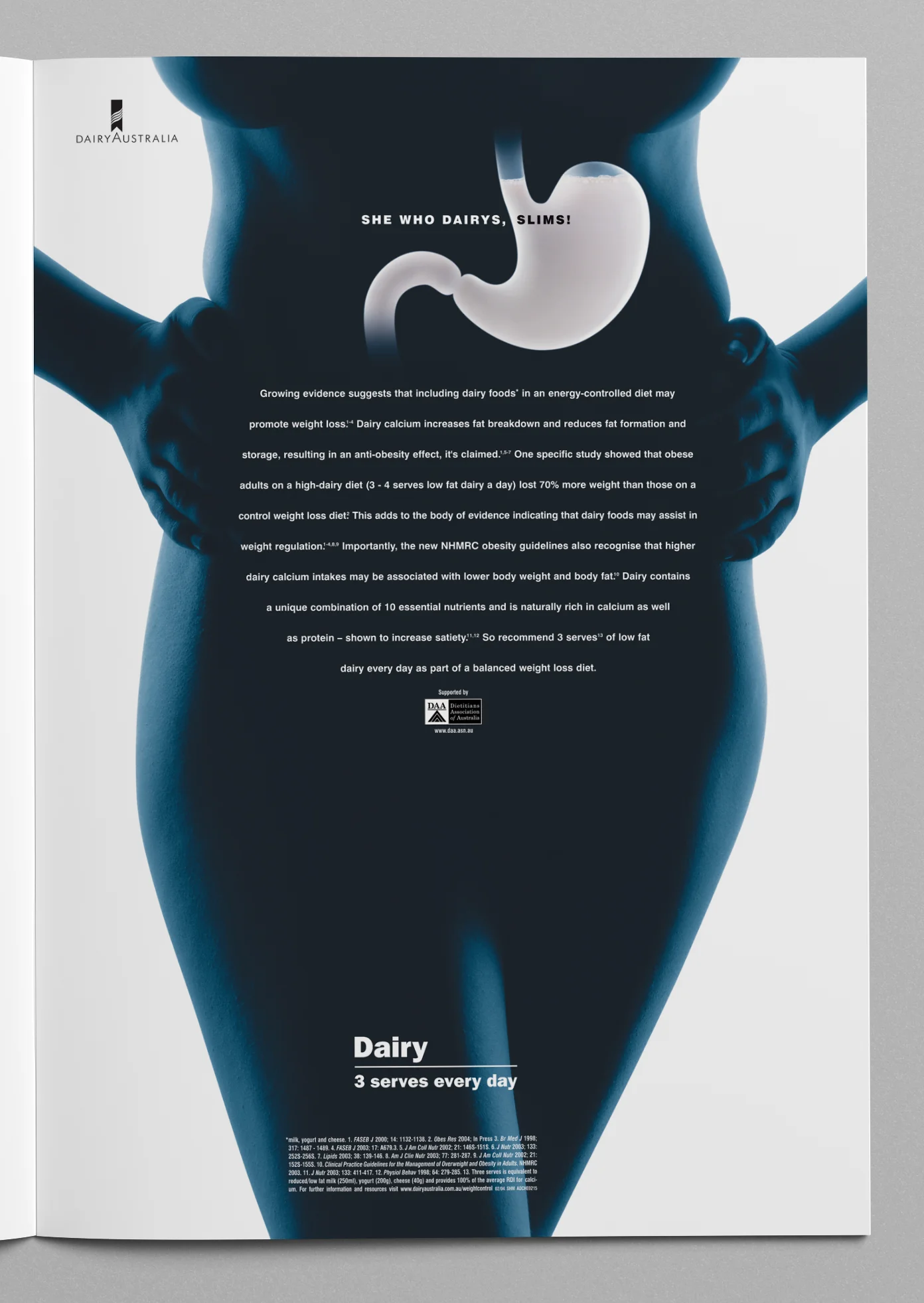
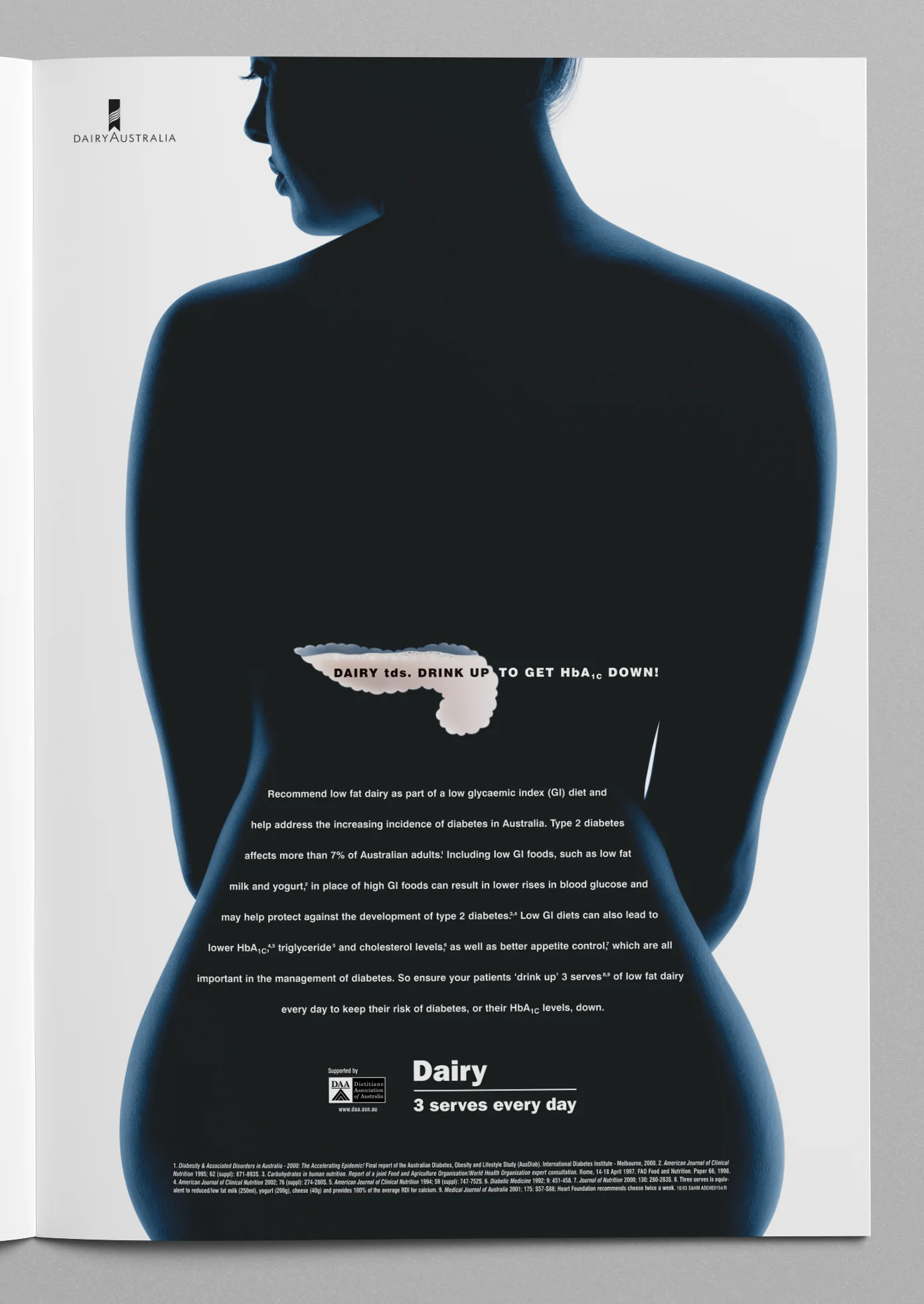
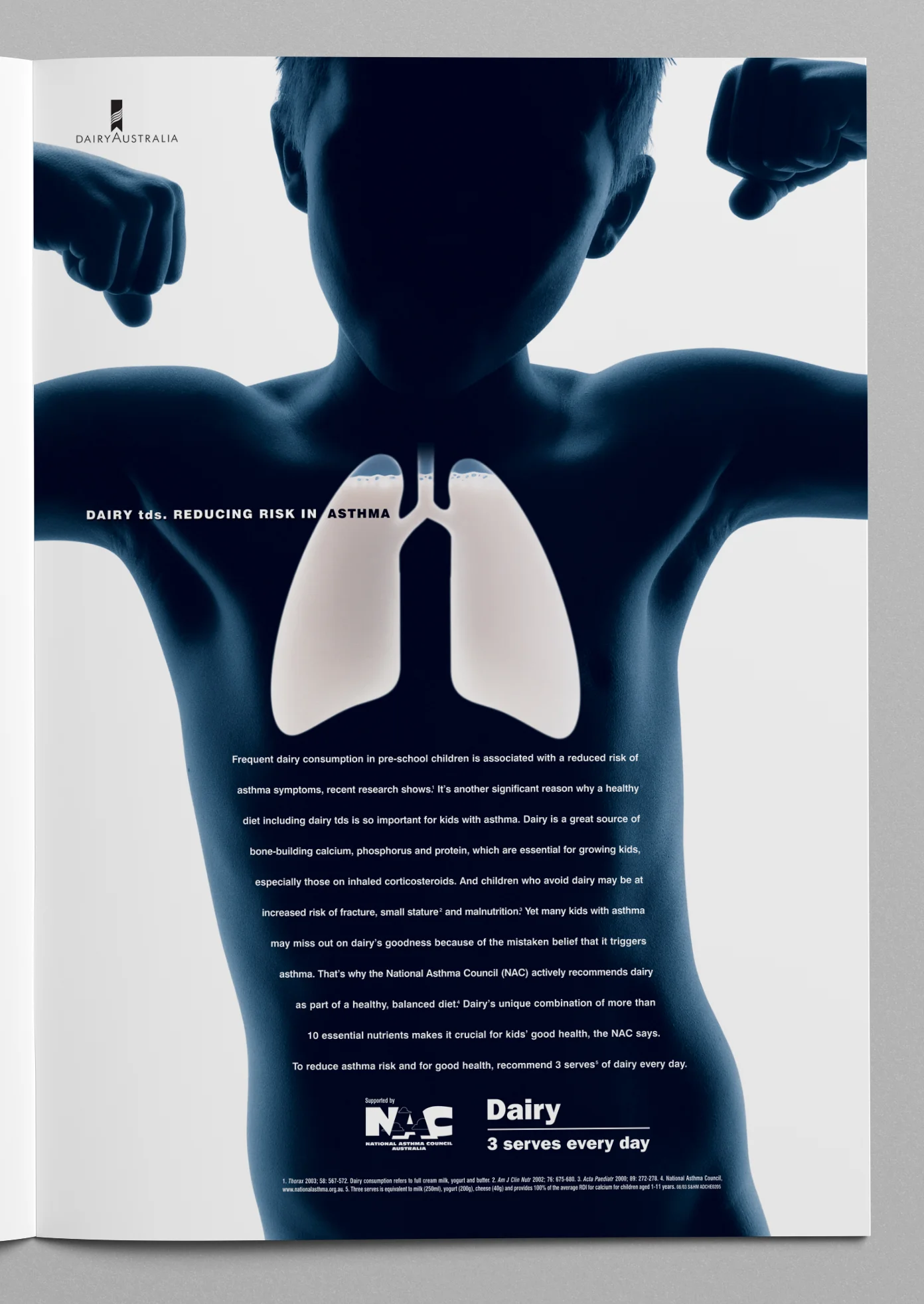
This long-running campaign for Dairy Australia encouraged GPs and dieticians to recommend 3 serves of dairy every day (as part of a balanced diet), for the crucial contribution it makes to good health.
The evidence-based campaign highlighted the positive effect the diet could have on a range of conditions including osteoporosis, blood pressure, cholesterol, weight reduction, diabetes and asthma. The campaign was supported by a variety of major studies with third-party endorsement from leading health organisations such as the Australian Heart Foundation, Osteoporosis Australia, the Dietitians Association of Australia and the National Asthma Foundation.
The campaign ran for approximately four years and consisted of dramatic, full-page magazine ads in the major Australian medical journals and was supported with engaging direct mailers that highlighted the condition, using a die-cut shape of the internal organ on a solid black cover which revealed the milk-filled organ and human shape upon opening the mailer. The mailer was accompanied by a questionnaire, which could be answered by simply reading the copy in mailer – correctly answering the questionnaire entitled the GP or healthcare professional to a set of fact sheets that were useful give-aways to patients with the relevant condition and also helped to establish a database of GPs and healthcare professionals for Dairy Australia's future marketing.
Winner: Silver Rx Award
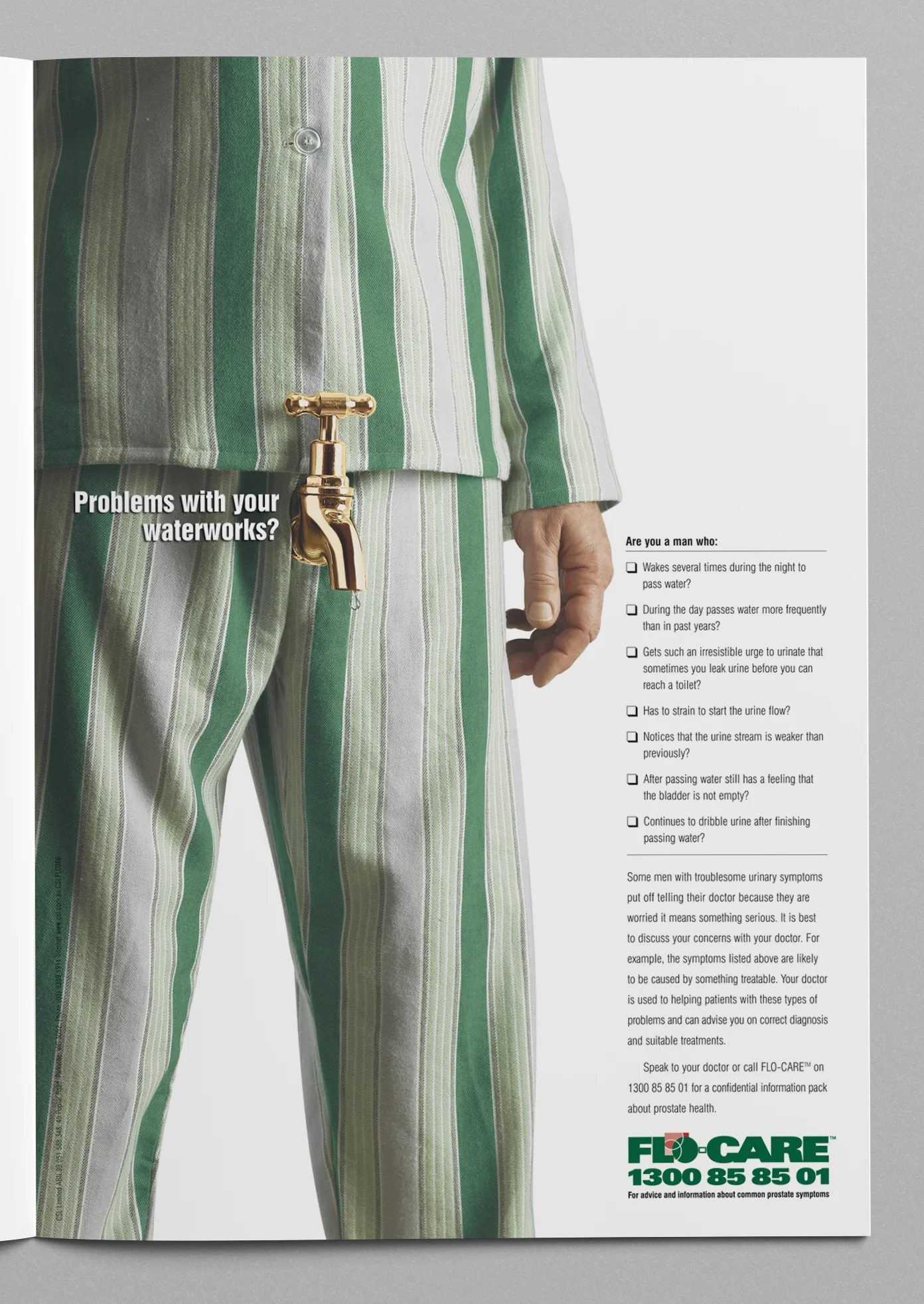
This campaign had a limited media spend so it needed to stand out and in order for it to be successful. The term 'waterworks' is often used as a polite reference to bladder problems, and this ad brought the term to life in a visual and surprising way that achieved real cut through.
As a prescription pharmaceutical, the Flomax brand was not permitted to be advertised to the general public in Australia. So a disease-state awareness campaign was created to help men identify their urinary symptoms, and either ask their doctor, or call the Flo-Care hotline to receive a confidential information pack. The green pyjamas served as the common link between the consumer and healthcare professional communications. Once a person had called the hotline a pack was also sent to their GP informing them of the enquiry and supplying them with all the required information.
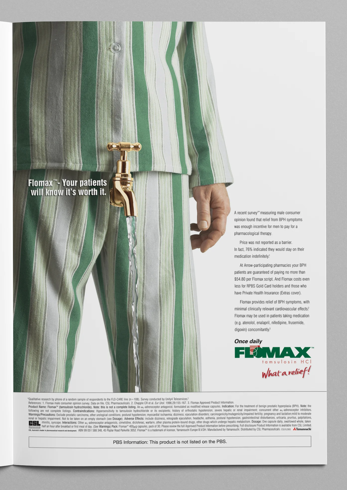
The second ad in this campaign was targeted at General Practioners and addressed the issue that GPs thought Flomax was too expensive and their patients wouldn't pay for it because it wasn't listed on the PBS, when in fact a survey had found this not to be the case.
The GP ad depicted a running tap instead of a dripping tap (solution rather than problem) with the headline reading "Flomax- your patients will know it's worth it".
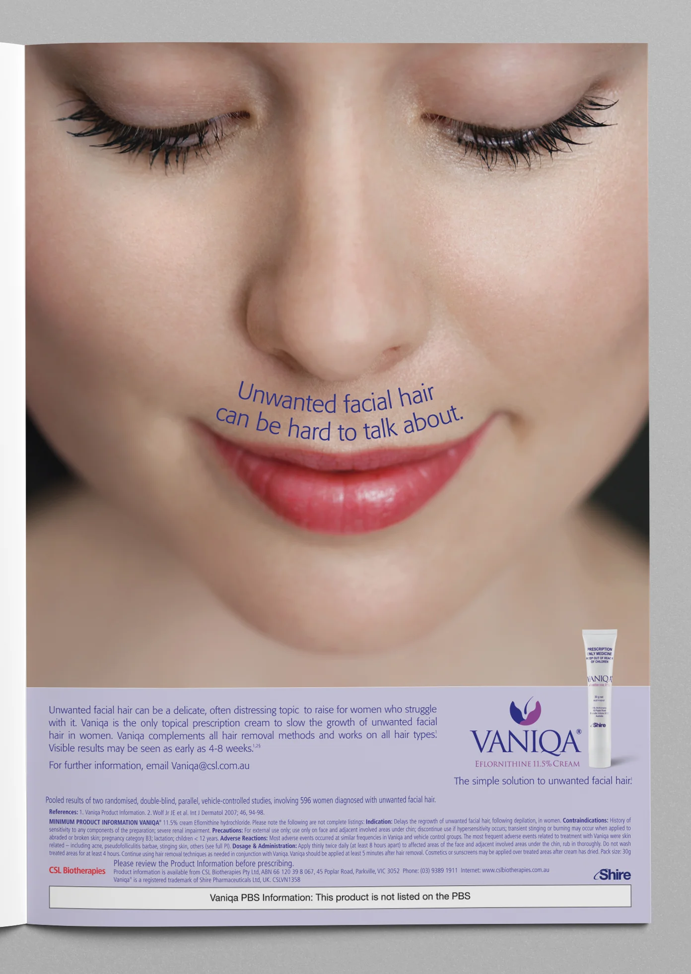
Often a product of this type would lend itself to typical before/after imagery but this concept for Vaniqa took a different path, by using typography to visually demonstrate the problem, and also to highlight the sensitive nature of this type of condition to those women who have to deal with it every day.
By giving the doctor a simple solution to this hard-to-talk-about problem, Vaniqa also enabled doctors to confidently initiate a discussion with their patient.
This campaign consisted of advertising in the two major Australian medical journals as well as having a direct mail component. The headline on the mailer was printed onto a clear cell overlay enabling the reader to physically remove the headline/unwanted facial hair — simply and visually, solving the problem.
Winner: Gold Rx Award
This simple video was created with a relatively low budget to entertain and motivate CSL Pharmaceutical reps at their National Conference and to highlight the key selling benefits of Flomaxtra (used in the treatment of LUTS/BPH) – Less Nocturia (waking with urinary symptoms) = More Energy = Improved Quality of Life.
Winner: Silver Rx Award
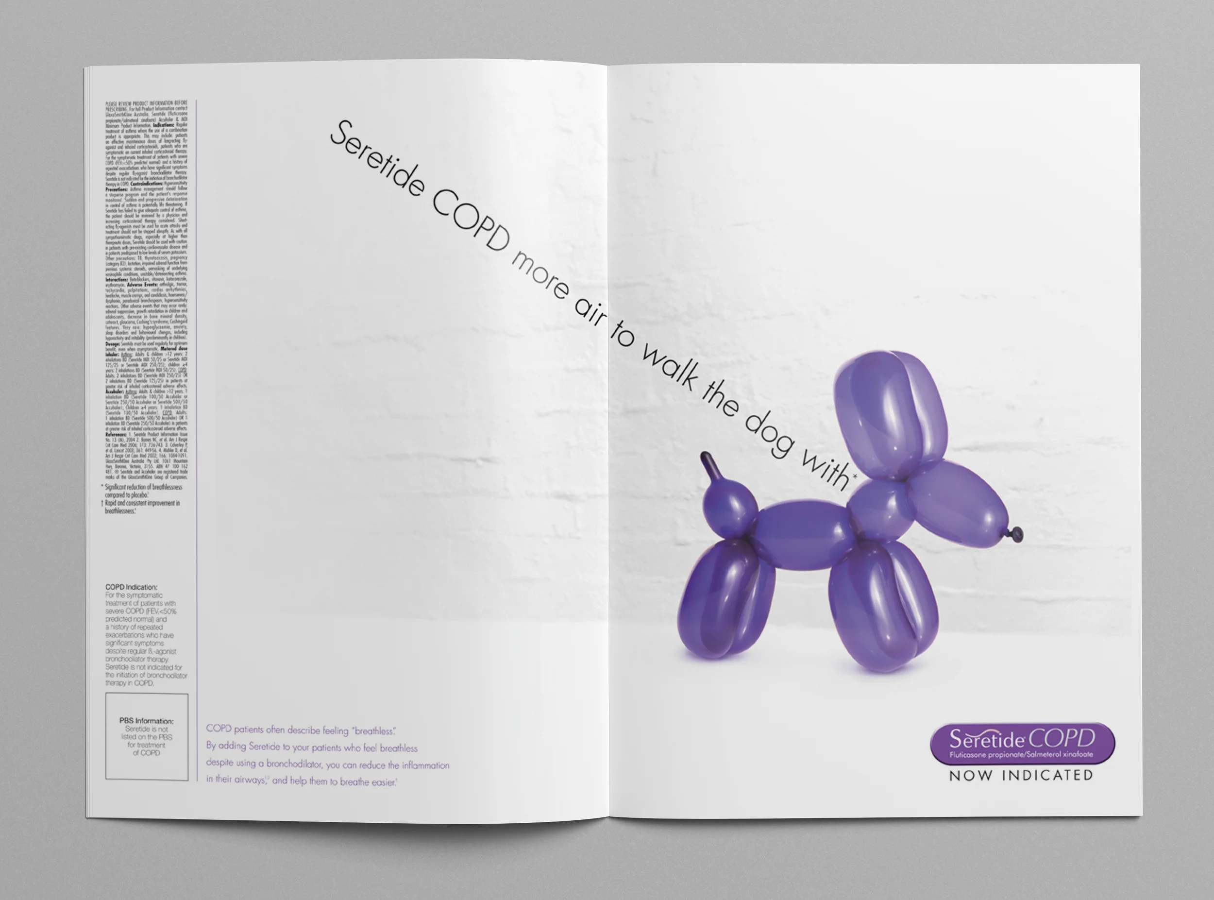
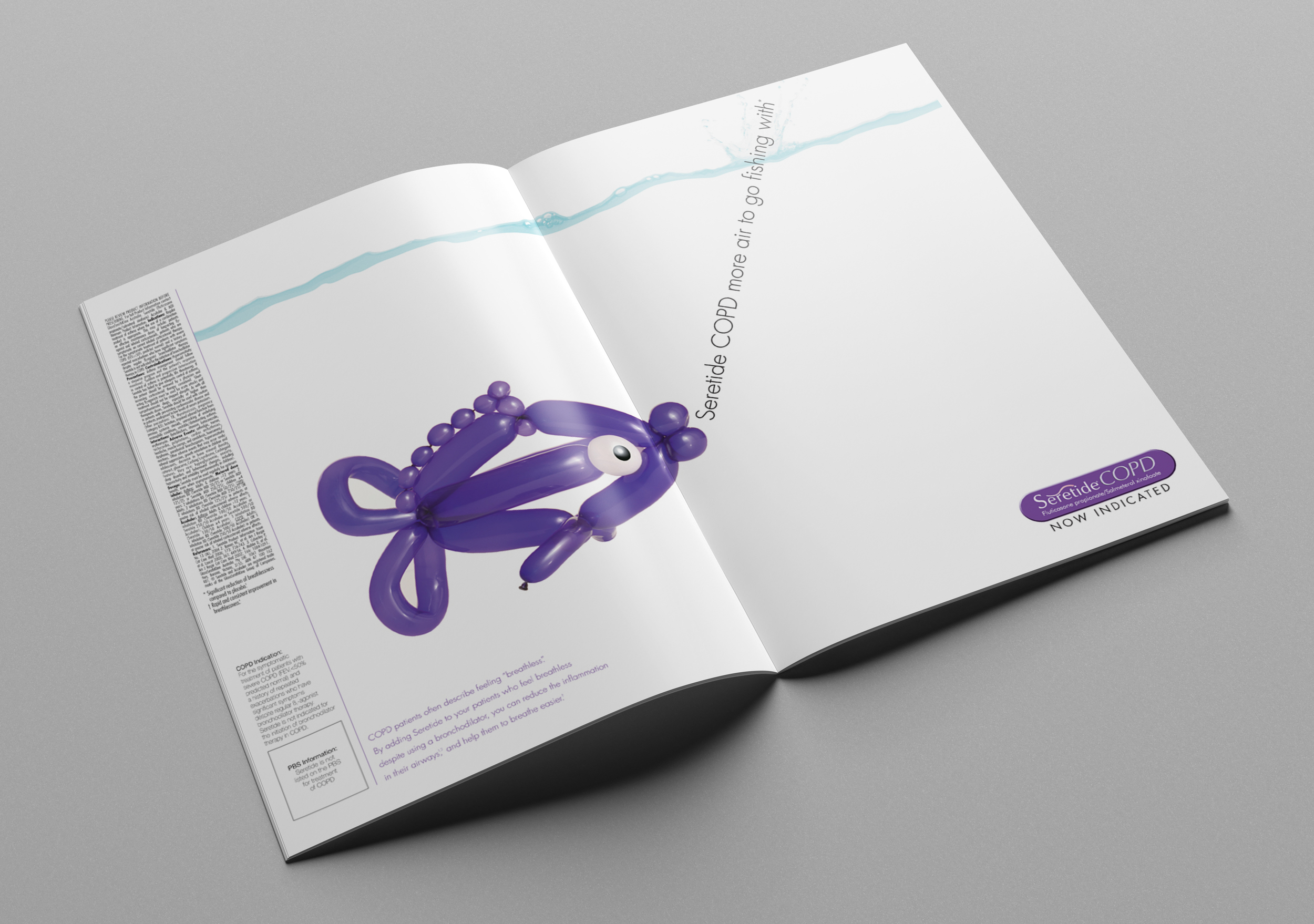
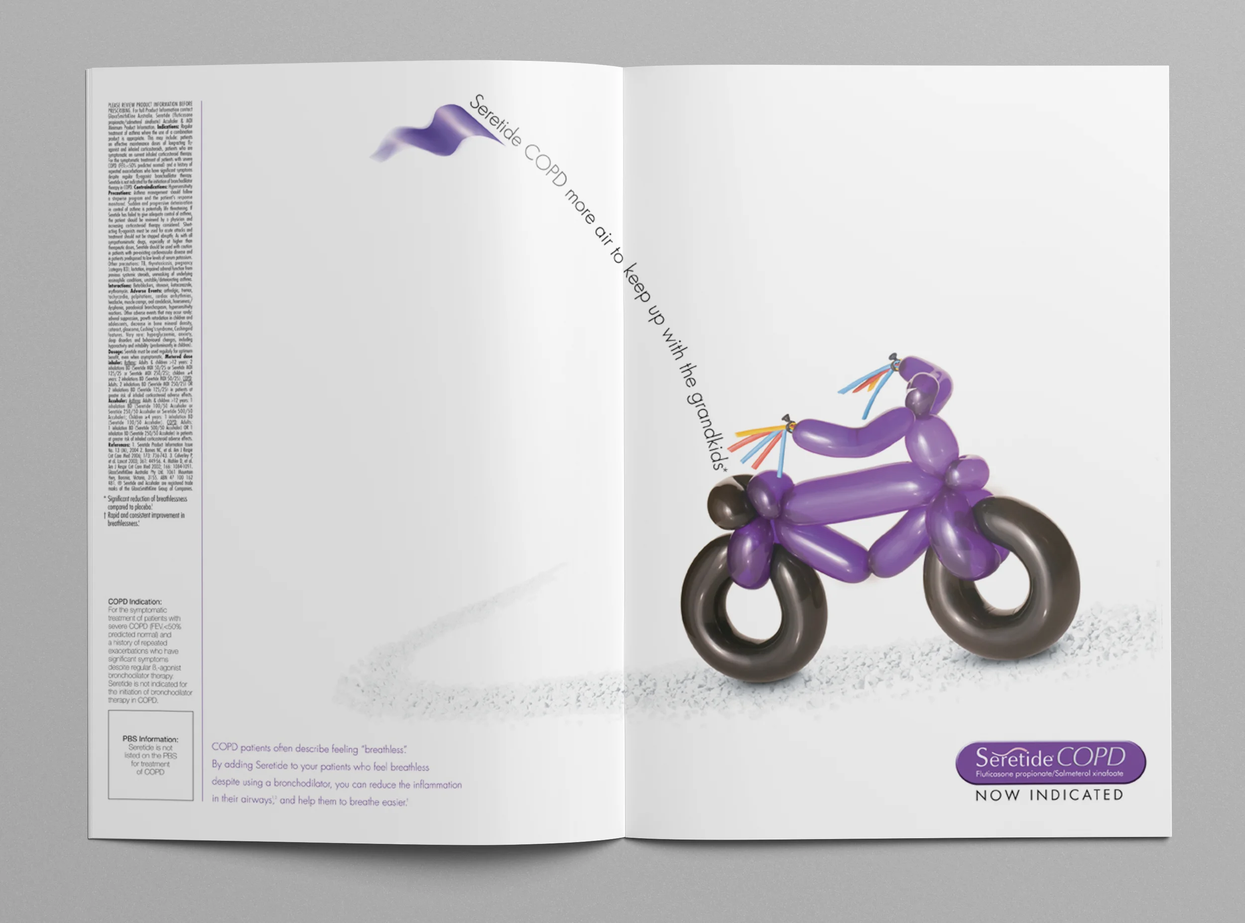
Seretide, (also known as Advair in the US) received a new indication in Australia for the treatment COPD.
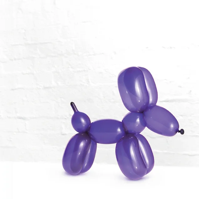
The Seretide brand had a long running campaign for the treatment of asthma using 'Puff' the purple dragon as a brand mascot but the brief was to steer clear of 'Puff' for the COPD campaign. The only mandatory was the use of the colour purple.
The Seretide Balloon Campaign depicted typical scenarios that may be a struggle for someone with COPD such as; walking the dog, fishing or just keeping up with the grand children — with the scenes created using purple balloons (representing 'more air'. Clever use of typography and subtle white backgrounds added to the stopping power and engaging nature of the imagery.
The campaign was launched with double page spreads and 6 page inserts in Australian medical journals and supported with various direct mail pieces (including one mailer with a purple dog lead giveaway) and sales aids.
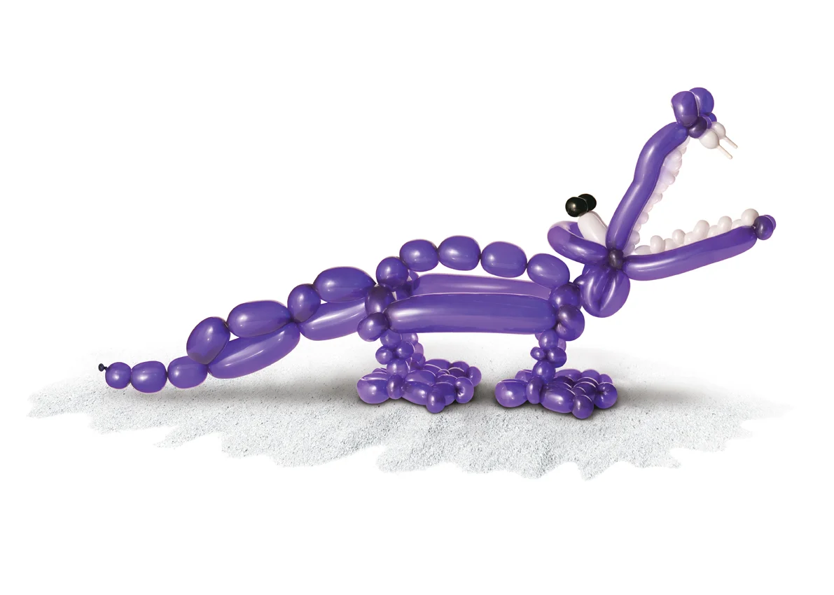
The final crocodile image was to be for a communication around the subject of morbidity, but unfortunately was never used.
The approach for this campaign was photographic path rather than 3d-rendered which added realism and charm. The shoot itself was quite an experience with a pair of incredibly talented and enthusiastic balloon artists.
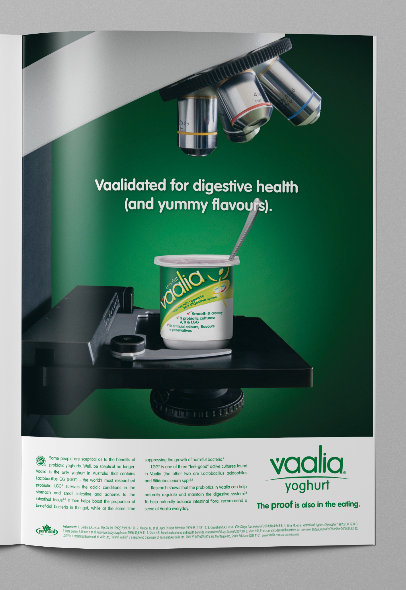
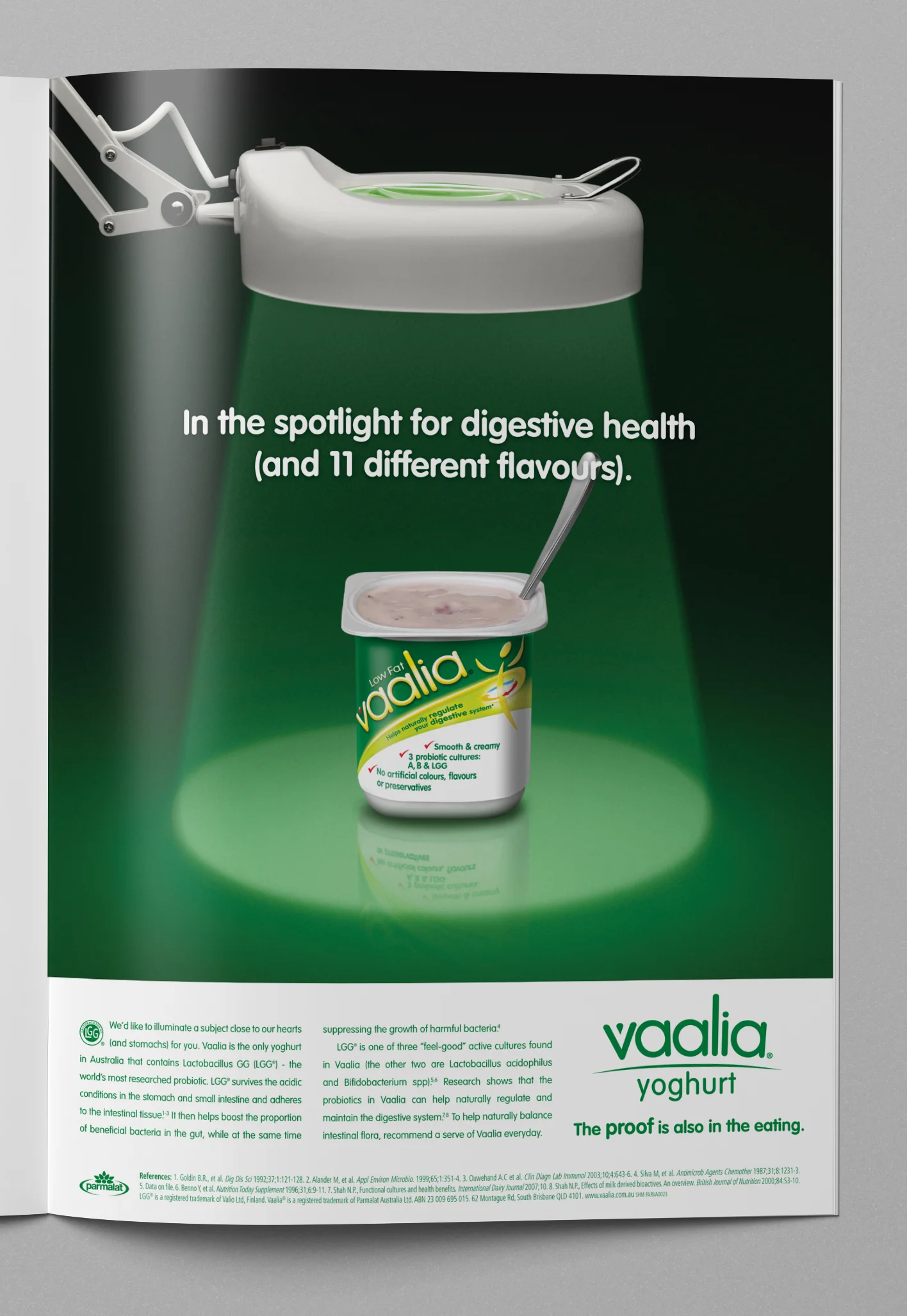
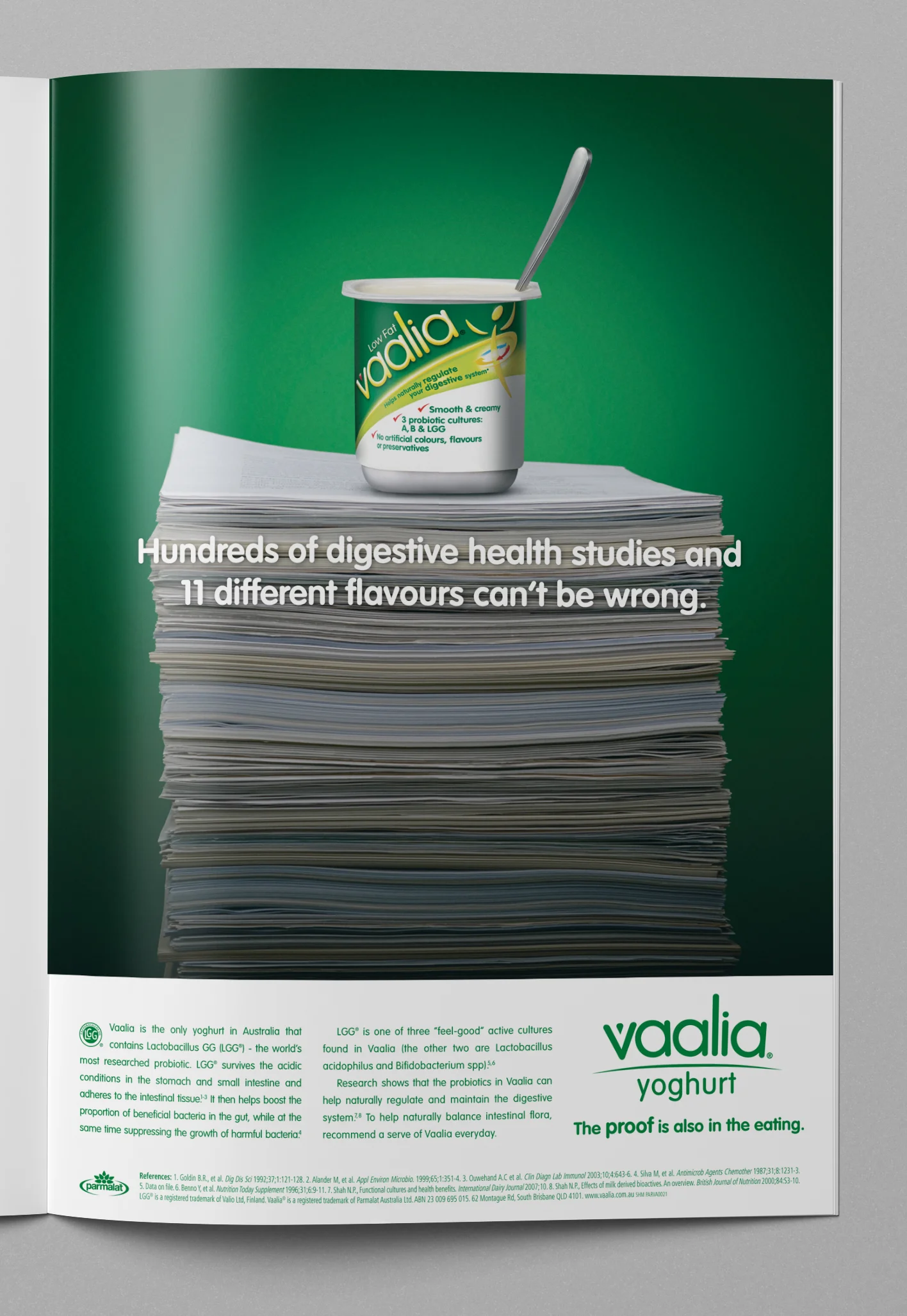
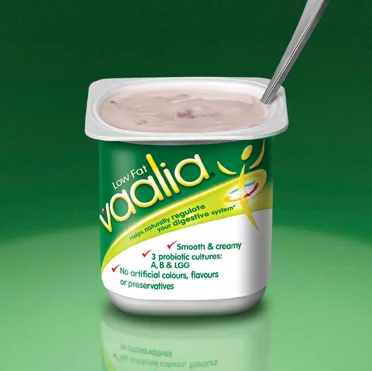
Vaalia was the only yoghurt in Australia that contained Lactobaccillus GG (LGG) — the world's most researched probiotic. Studies had shown that the LGG in Vaalia had been helpful with reducing the gastrointestinal side effects associated with antibiotic therapy. So a campaign to general practitioners was created to highlight the proven qualities of Vaalia and to encourage them to recommend this brand of yoghurt to their patients.
The campaign depicted three different scenarios; a tub of Vaalia under a microscope, a tub of Vaalia under an examination light and a tub of Vaalia on top of a stack of research paper — indicating that this brand has stood up to the highest scrutiny.
A humorous play on the word 'validated' worked perfectly for this campaign by adding an extra 'a' the word becomes Vaalidated — effectively branding the key message. As well as it's therapeutic qualities, Vaalia was also a great tasting yoghurt which was highlighted in the headline and the positioning statement.
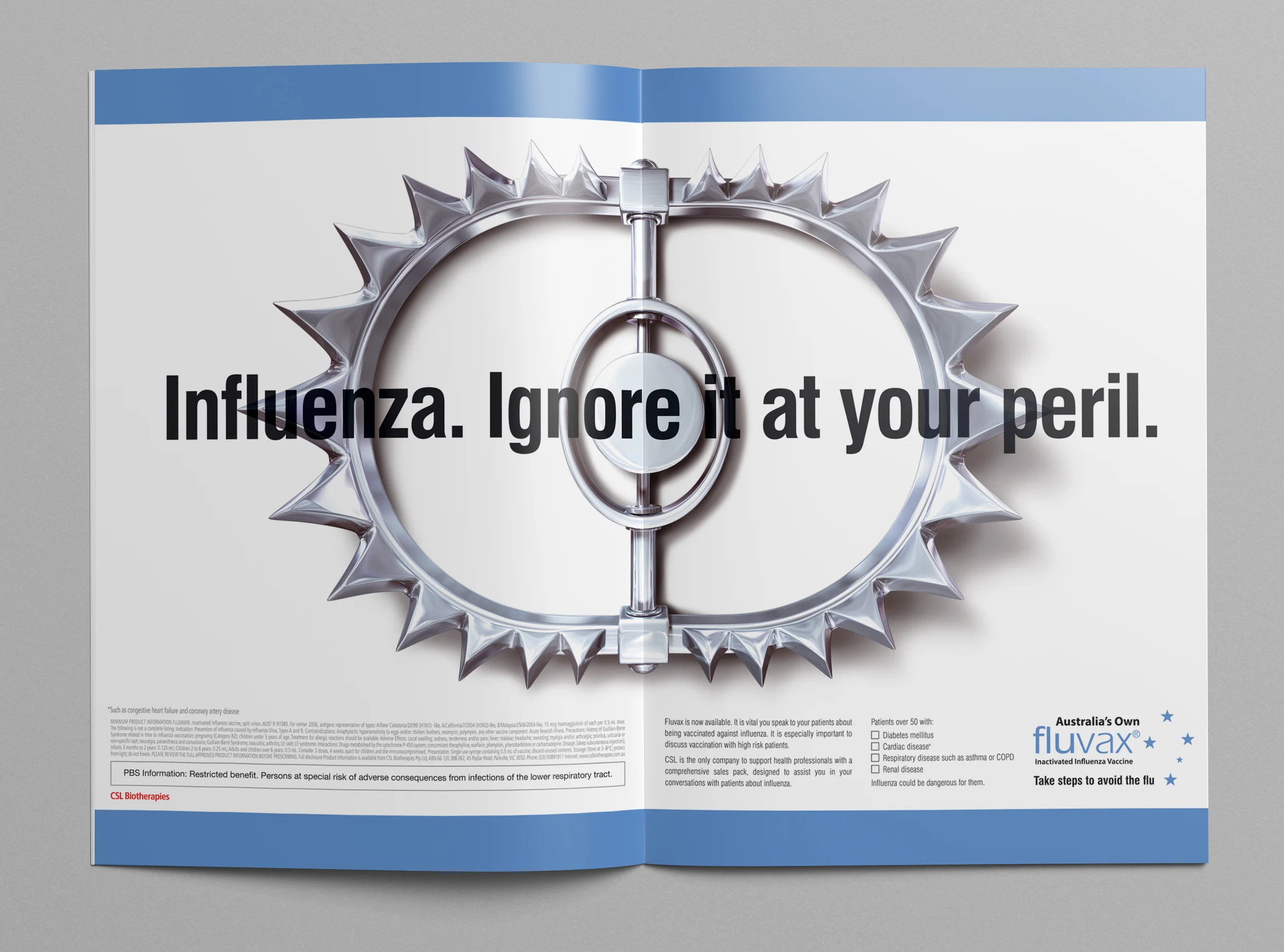
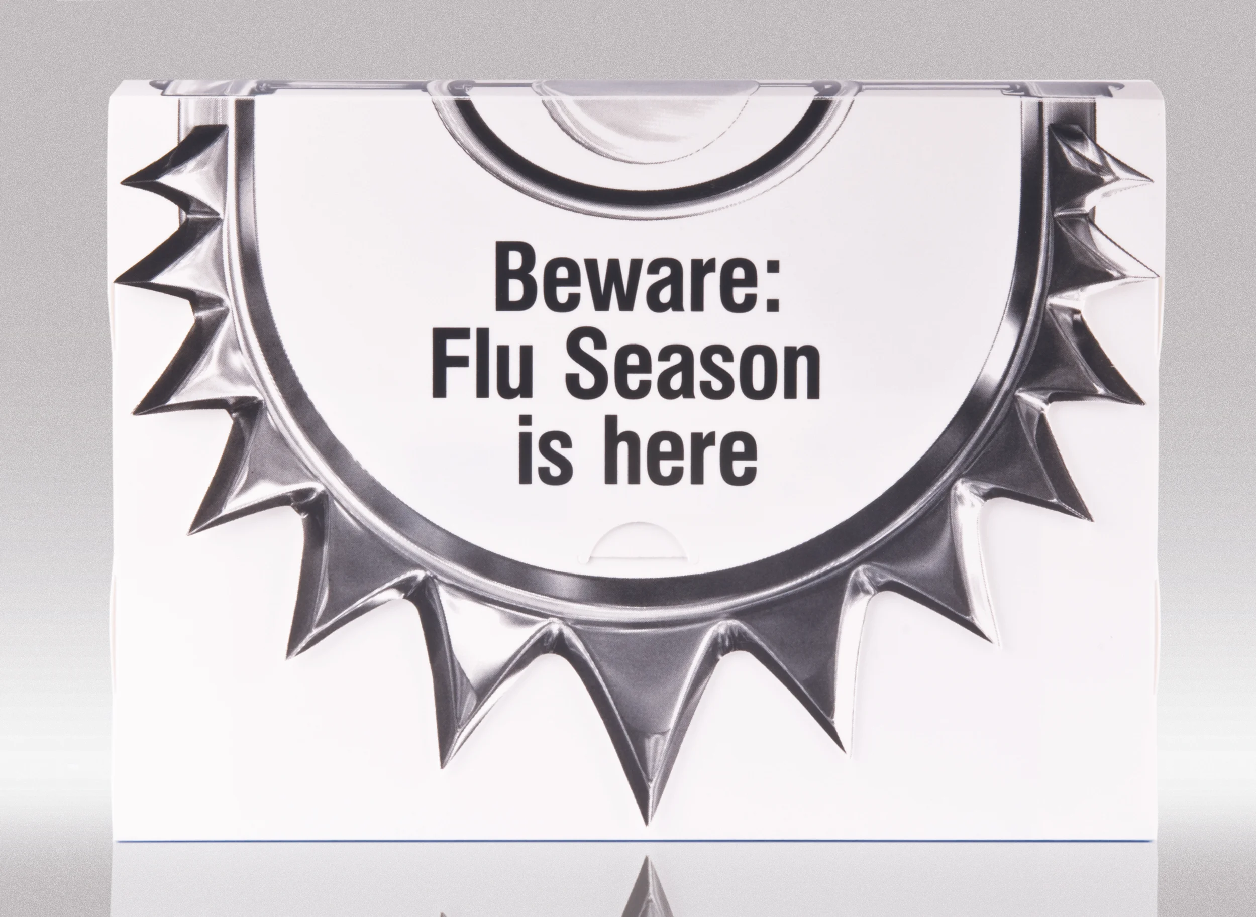
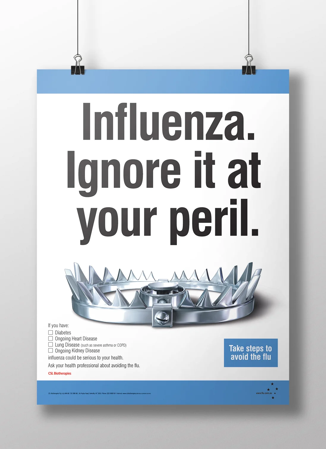
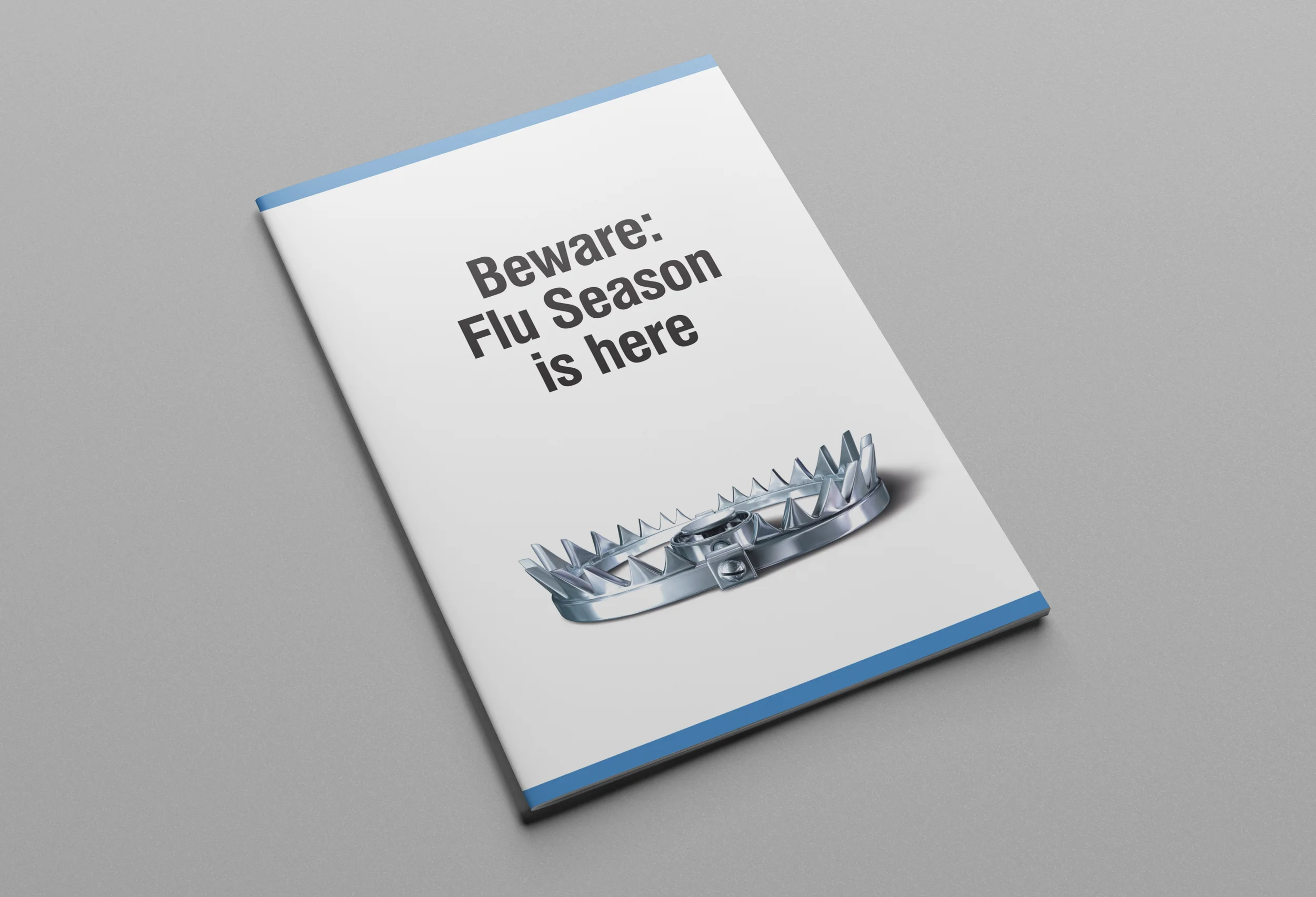
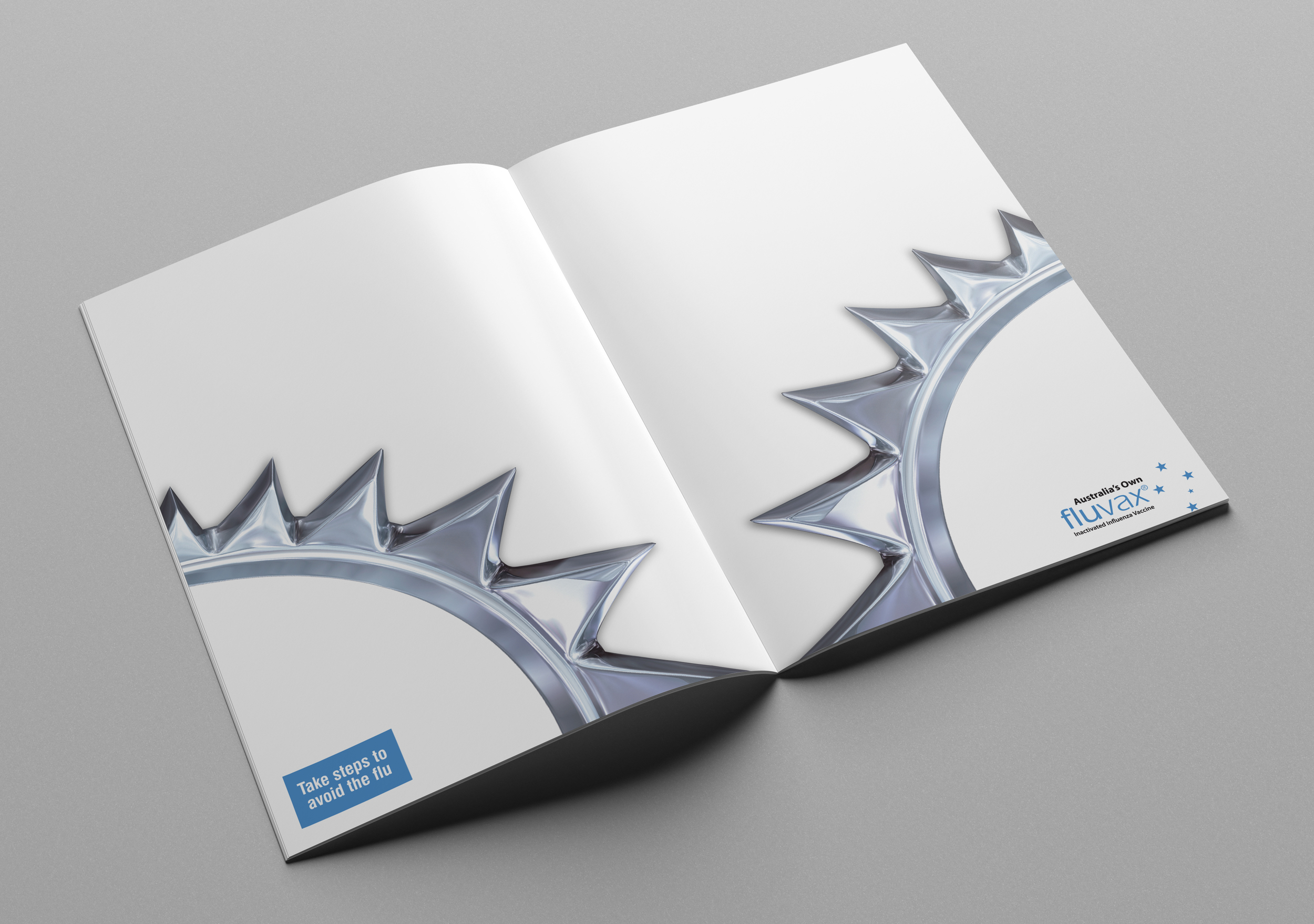
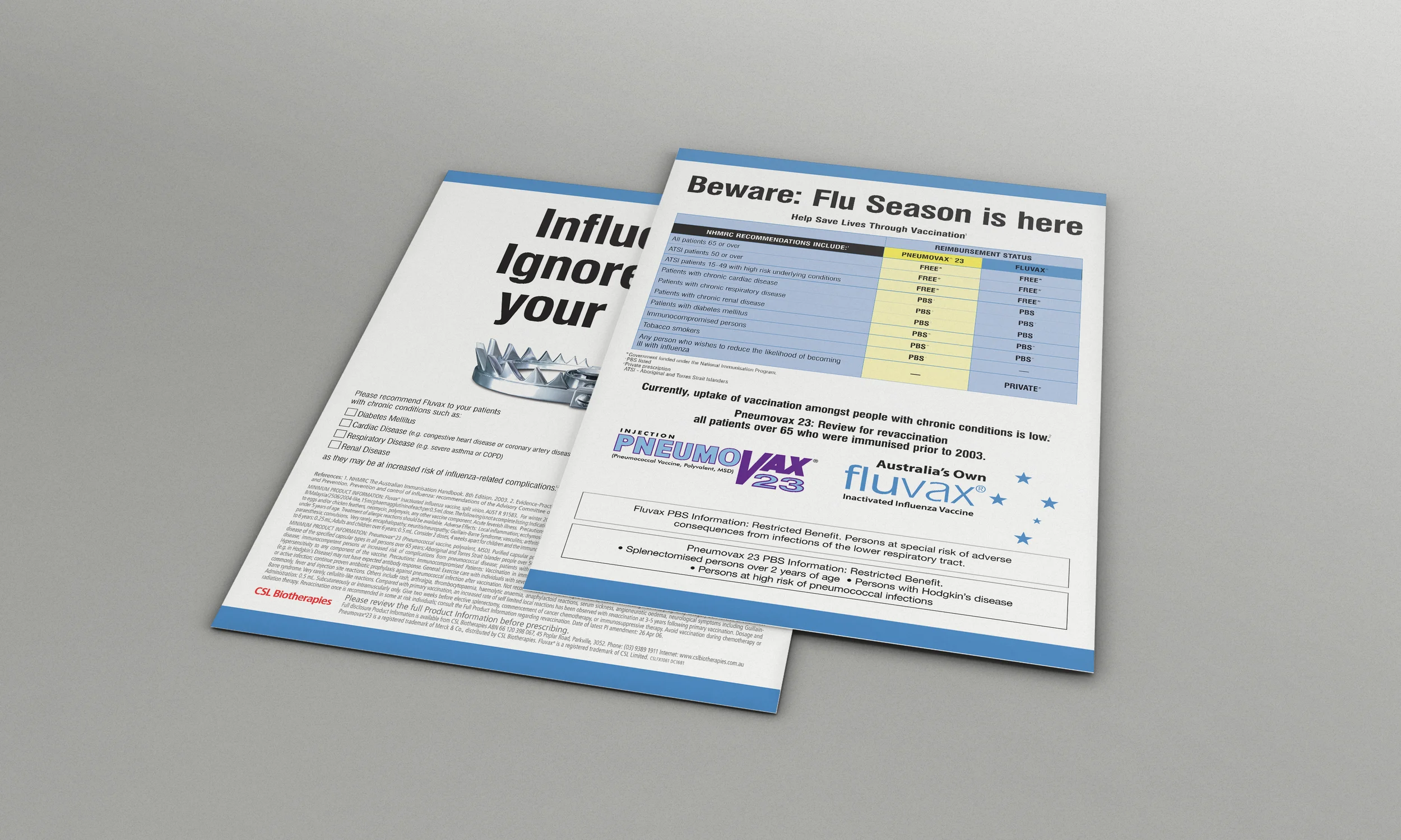
Fluvax 'Trap' Magazine DPS and Pharmacy Pack
Winners: Rx Award of Excellence
The mnemonic device of the highly-polished, 3d rendered trap image bridged the gap between the healthcare professional messaging and consumer messaging. Communications to doctors and pharmacists read 'Influenza - Ignore it at your peril' and were accompanied by the trap image – actively promoting the Fluvax brand name, while communications to consumers read 'Take steps to avoid the flu' with the trap image used as the memorable branding device.
A double page spread was the perfect placement for the Fluvax 'trap' ad with the fold of the magazine highlighting the trap mechanism. The ad reminded doctors and pharmacists of the impending influenza or 'flu' season and that Fluvax was now available, meaning they could now recommend vaccination for their at-risk patients.
The ad also explained that CSL had a comprehensive sales pack that was designed to help with conversations to patients about influenza. The pack included a polypropylene folder with the die-cut teeth of a trap on the flap, A2 and A3 clinic and pharmacy posters that warned of the perils of influenza, A3 posters for businesses to announce a vaccination day for staff members, heavy duty trap-shaped stickers for pharmacy floors and DL 4 page information brochures for patients.
Winner: Silver Rx Award
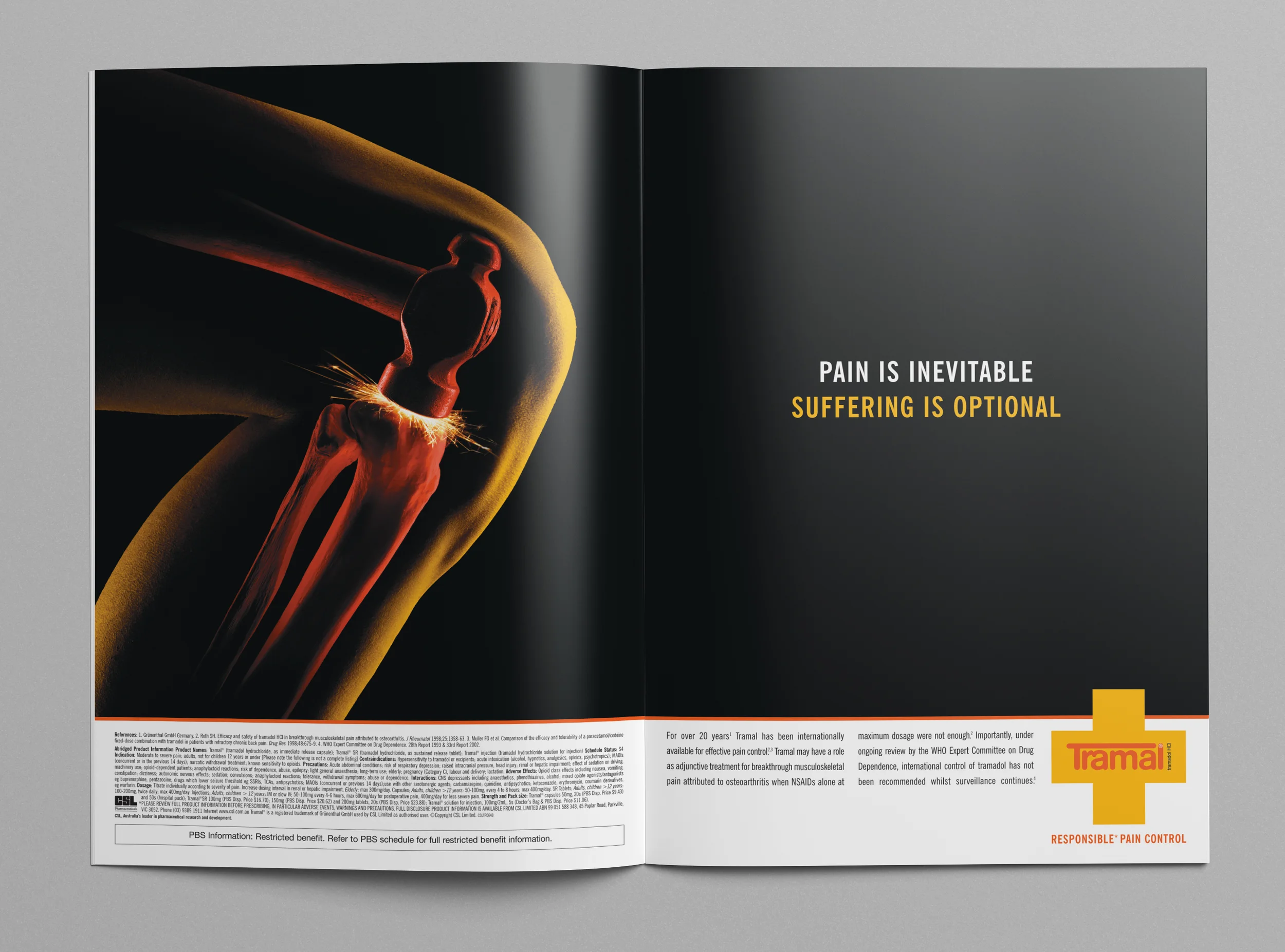
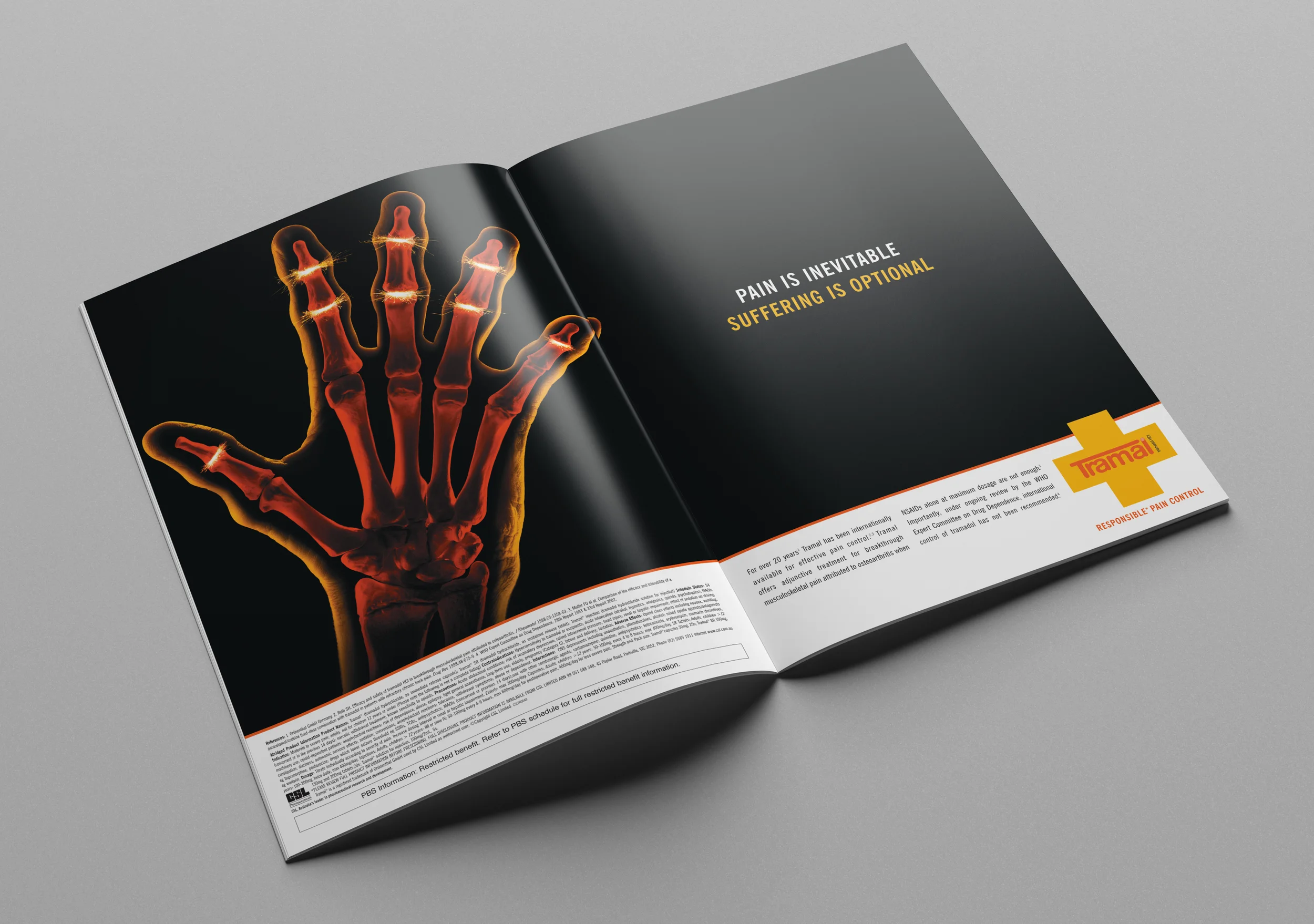
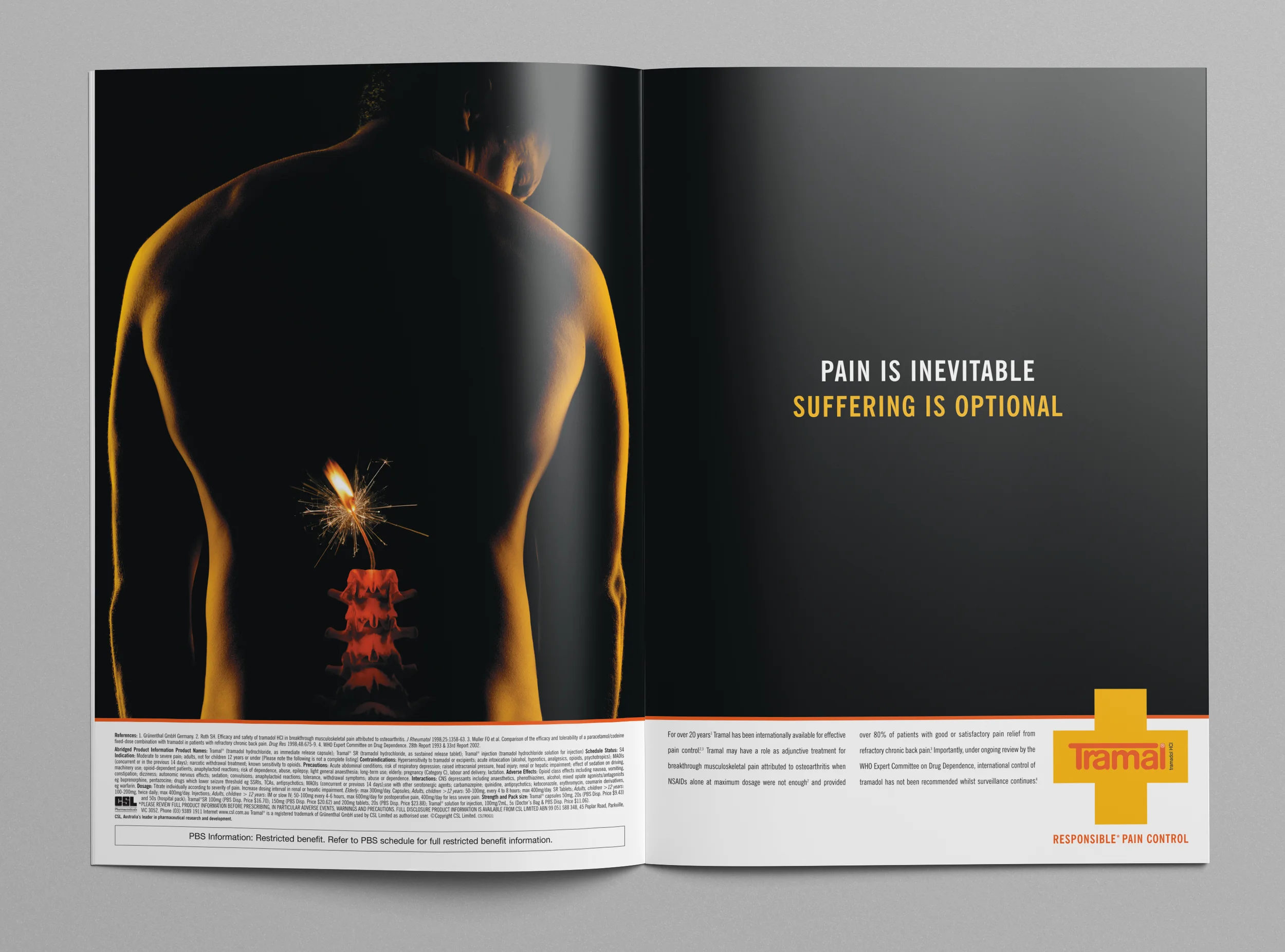
Tramal Campaign
Tramal (Tramadol) was a brand that had been available Internationally for more than 20 years at the time of this campaign. The market was used to the predictable images associated with the brand. So, large double-page spreads with powerful images that demonstrated and dramatised musculoskeletal pain were designed to breathe new life into the brand and to standout and get attention. The headline – 'Pain is inevitable, suffering is optional' highlighted the efficacy of Tramal, while the positioning line 'Responsible Pain Control" underlined the safety aspect of Tramal compared to morphine in the treatment of post-operative pain.
The story of Sisyphus (a hero from Greek mythology) was brought to life for the launch of Tramal-SR into the Australian market. Sisyphus was condemned to an eternity of hard labour by being made to roll a great boulder to the top of a mountain. Every time he reached the summit the boulder would roll down to the bottom meaning he had to begin the task again.
The story fitted perfectly with the slow-release aspect of Tramal-SR which helped those patients requiring persistent pain management.
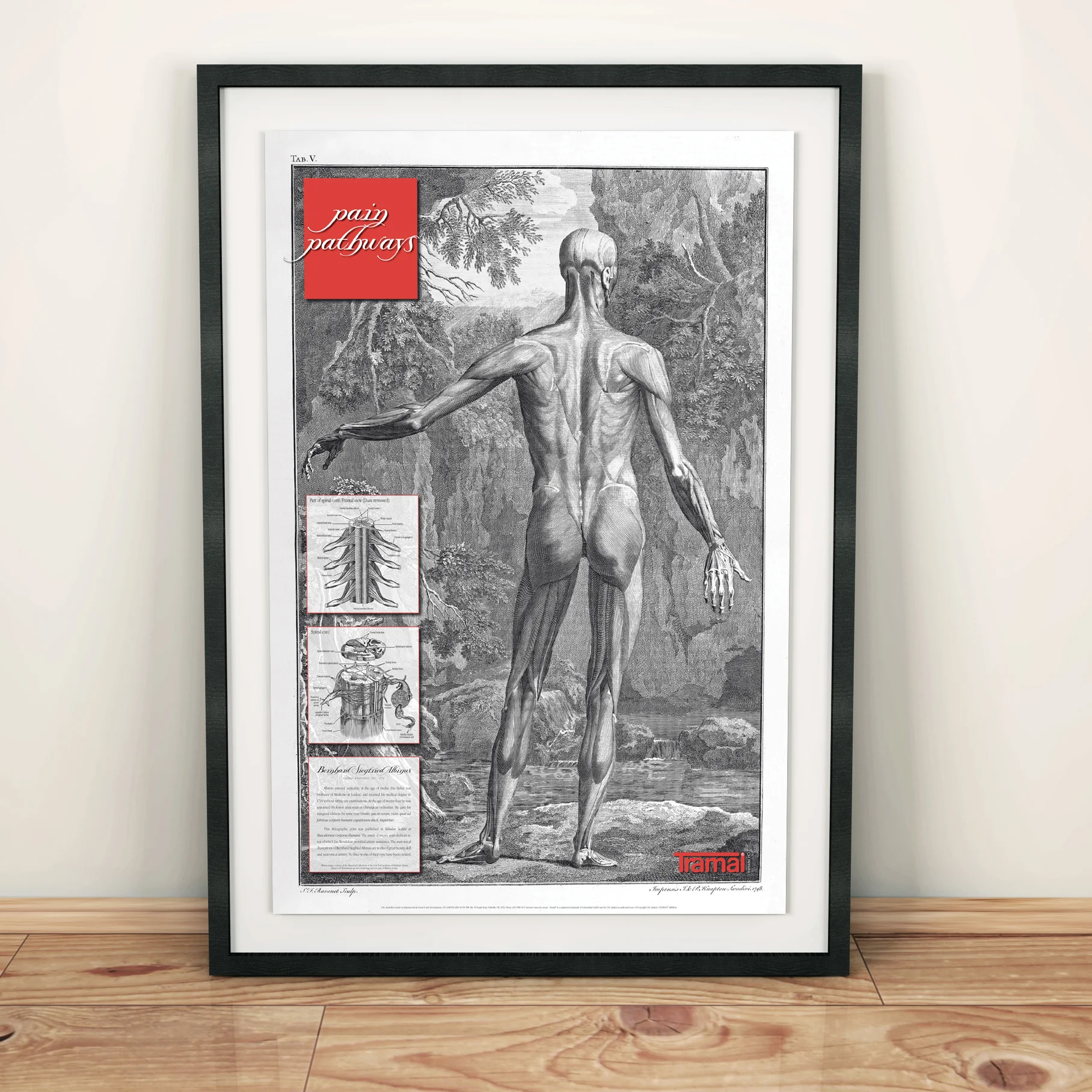
Tramal Pain Pathways Poster
Winner: Rx Award of Excellence
The original 1747 lithograph by Bernhard Siegfried Albinus used in the creation of this poster was sourced and approved for reproduction from the New York Academy of Medicine Library. The two smaller inset images detailing a nerve cross section and a spinal chord frontal view were illustrated to perfectly match the original Albinus style. Printed on archival quality paper in limited edition, this poster was a brand reminder, highly sought after by medical practitioners.
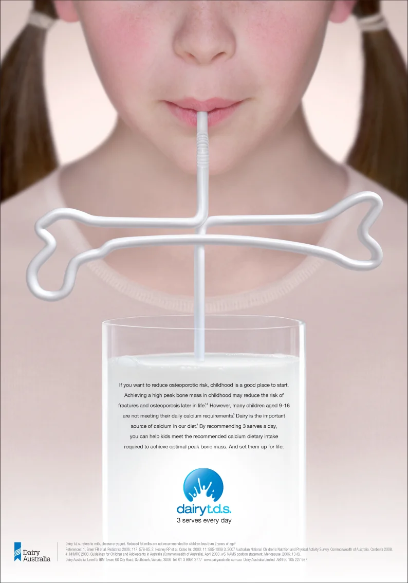
Dairy t.d.s. - 3 serves every day
No headline required – the femur-shaped straw provided a striking and engaging visual that said it all.
The next step from the long running Dairy Australia Silhouette Campaign, this full-page ad ran in the major Australian medical journals. It encouraged General Practitioners to recommend three serves of dairy every day from childhood to reduce the risk of fractures and osteoporosis later in life.
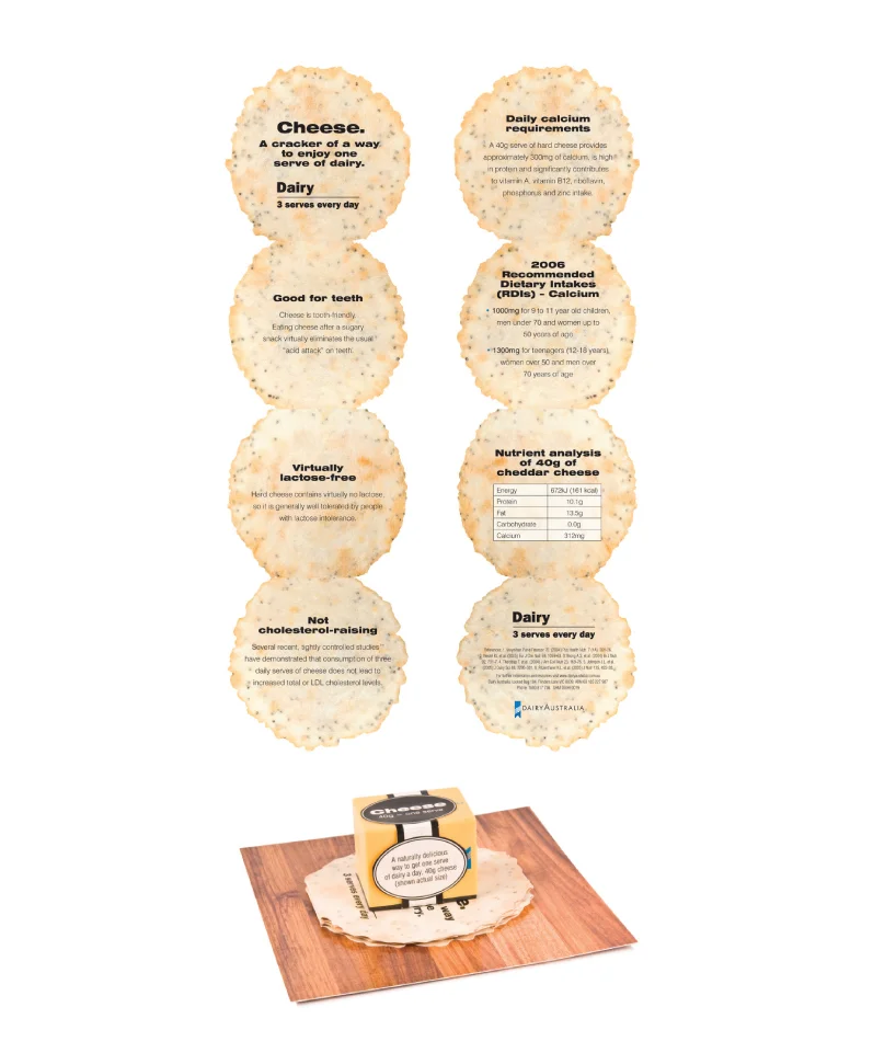
'One Serve of Cheese' magnetic leave behind
Winner: Rx Award of Excellence
This novel conference giveaway was used to demonstrate how small one serve of dairy actually is. And what better way to serve up a magnetic piece of cheese than on a cardboard cheeseboard with cardboard crackers! The die-cut crackers folded up into a small eight page brochure with each page/cracker detailing a different fact about dairy.
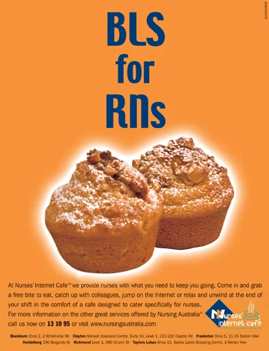
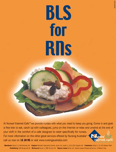
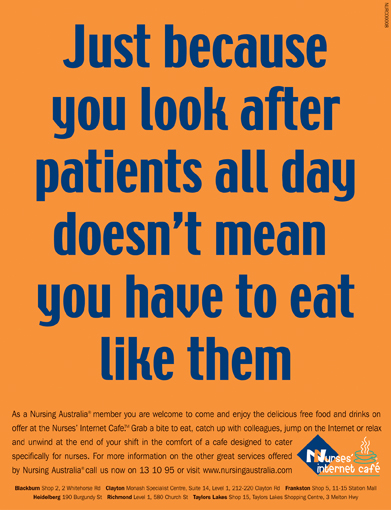
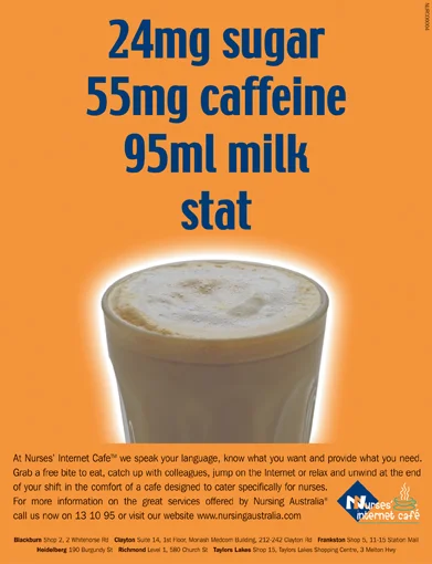
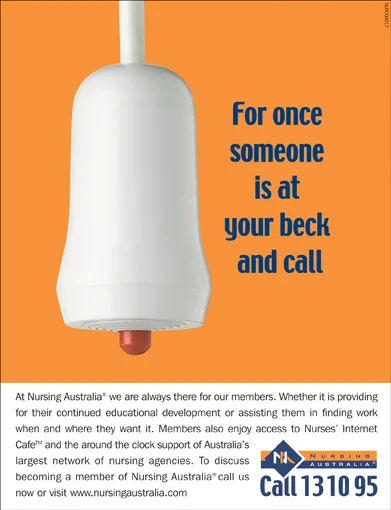
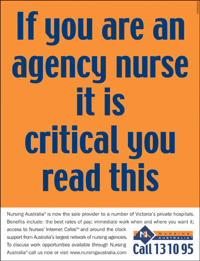
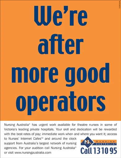
The recruitment of nurses throughout Australia was highly competitive at the time this campaign for Nursing Australia launched. The creative approach was to use nursing acronyms to highlight the free food and coffee available at the Nurse's Internet Cafes operated by Nursing Australia. This approach extended to the general recruitment ads as well, by demonstrating an understanding of nursing life and delivering the recruitment message in a light-hearted and friendly way.